


-
Recent Posts
- Why AI Builders Become Unaffordable at Scale (And the UltimateWB Alternative)
- Why Is Google Indexing New Blog Posts So Much Slower in 2026?
- Why Does Google Gemini Keep Saying “Something went wrong (1099 or 1076)”?
- What Happened to Reddit? API Changes, Shadowbans, Bots, and Community Decline
- What’s Going On with the Etch WP Team? (Digital Gravy Drama Explained)
- Why is the Discover tab missing now from Google Search Console?
- Big Tech’s New Excuse: The AI Smoke Screen
- WooCommerce Subscriptions Cost: Avoid the $279 Add-On Trap
- The Dogfooding Test: What Happens When Web Platforms Don’t Use Their Own Tools?
- Webflow’s 2026 Layoffs Exposed the SaaS Illusion
- The 2026 Kadence WP Corporate Takeover: What Liquid Web’s Consolidation Means for Your WordPress Website
- Why Windows Suddenly Says “Activate Windows” – And How to Fix It Easily
- How to Restore Accidentally Closed Browser Windows and Tabs
- The Right Way vs. The Wrong Way to Do Programmatic SEO (pSEO)
- Stop Fighting Your Website: Absolute Positioning vs. Fluid Design
- Is Your Google Search Console “Average Position” Lying to You?
- Webflow’s 2026 Price Hike: When “Premium” Means Less Bandwidth
- The WordPress Events Calendar Pro Price Hike – and the Alternative
- How can I avoid “AI SEO sludge”?
- What is the difference between advertising and marketing?
Categories
- Accessibility
- Advertising
- Affiliate Programs
- Announcements
- Apps Comparison
- Ask David!
- Business
- Compare Website Builders
- Computer Tips
- Domain Names
- E-commerce
- Emails
- Facebook Application
- General
- Graphic Design
- Integration Tutorials
- Mailing List Application
- Marketing
- Photos Management
- Search Engine Optimization (SEO)
- Social Media
- Social Networking
- Software Showcase
- Technology in the News
- Traffic Statistics
- Troubleshooting
- Web Content
- Web Hosting
- Website Design
- Website Security
- Website Traffic
- WordPress Customization
Meta
Tag Archives: contrast
What’s the best way to create a high-quality Favicon and add it to your website?
A favicon might be small, but it plays a big role in your website’s branding and user experience. That tiny icon in the browser tab, bookmarks, and shortcuts helps visitors recognize your site instantly and gives your website a professional touch. So, how do you create a high-quality favicon that stands out? And how do you add it to your website the easy way? Let's
... Continue reading
Posted in Ask David!, Website Design
Tagged bookmarks, branding, browser tab, browser tab icon, contrast, create favicon, favicon, favicon design, GIMP, Gimp favicon, high-contrast colors, internet browser icon, photoshop, Photoshop favicon, PNG to ICO, shortcuts, upload favicon, user experience, web design tips, website branding, website customization, website icon, website recognition, website user experience
Leave a comment
Tutorial: How to Instantly Make Your Designs Look Cleaner
Ever notice how some websites or graphics just feel “off,” even if you can’t put your finger on why? Most of the time, it comes down to a few small mistakes that make a layout look messy. The good news: once you know what to look for, you can fix these issues quickly and make your work look more polished and professional.
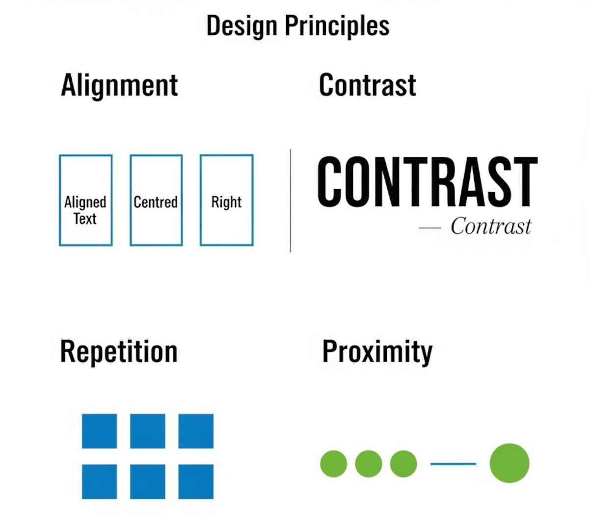
Here’s a simple tutorial on the four core principles that will clean up almost any design.
1. Alignment:
... Continue reading
Posted in Website Design
Tagged alignment, avoid clutter, beginner design guide, clarity, clean design, clutter, color, consistency, contrast, design consistency, design hacks, design principles, design repetition, design tricks, design tutorial, fonts, good design, improve website design, layout design, proximity, repetition, spacing, trust, trustworthy, ux design, visual hierarchy, web design tips, white space, whitespace
Leave a comment
What Makes a Simple Website Feel Trustworthy? (From Real User Experience, Not Theory)
When you’re visiting a website built by a solo creator or small team - not a big-name brand - you make a snap judgment: Can I trust this? That first impression often decides whether you stick around or bounce.
As someone who loves studying user behavior and indie websites, I’ve noticed a few key elements that consistently build trust, even on simple, self-made sites.
Here’s what makes me - and many others - stay.
1. Clear Purpose, Fast
If I
... Continue reading
Posted in Ask David!, Business, Website Design
Tagged brand personality, build trust, clarity, communicate clearly, contrast, fonts, indie web, personal website, personality, small website, solo creator, trust signals, user experience, ux design, web design tips, website credibility, website trust, white space
Leave a comment
Web Design Fundamentals: A Comprehensive Guide
Introduction
Web design is always evolving, combining creativity, usability, and functionality to build websites that are not just visually appealing, but also easy to use and effective. Whether you're a beginner or an experienced designer looking to refine your skills, understanding the fundamentals of web design is crucial. In this guide, we will explore key concepts and best practices that are
... Continue reading
Posted in Website Design
Tagged accessibility, alt text, aria labels, brand identity, branding, build trust, call to action, color psychology, color scheme, color theory, colors, consistency, contrast, contrasting color, cta, digestible content, easy navigation, fast loading times, font sizes, fonts, goals, header tags, headings, line spacing, logo, mobile friendly, paragraph length, purpose, responsive, responsive app, search engine optimization, search engine ranking, seo, short paragraphs, styles manager, subheadings, target audience, typography, user engagement, user experience, user-centered design, user-friendly, ux, ux design, visual hierarchy, website goals, whitespace
Leave a comment
What are some best practices for designing a homepage that converts visitors into customers?

A homepage that converts visitors into customers should be designed with a clear understanding of your target audience and their needs. Here are some key best practices to follow:
Focus on Value Proposition:
- Clear and Concise Headline: Your headline should immediately communicate what your product or service does and its key benefit to the visitor.
- Benefit-Oriented Content: Instead of technical jargon, explain how your product or service solves the visitor's problem or improves their life.
- Visually Appealing Hero Section: The
Posted in Ask David!, Website Design
Tagged a/b testing, benefit-driven features, benefit-oriented content, call to action, clean design, clean layout, contrast, conversions, cta, fast loading times, headline, hero banner, homepage, mobile friendly, page history tool, simple layout, social proff, technical jargon, testimonials, trust signals, user experience, user friendly, value proposition
Leave a comment
How to Test the Color Contrast of Your Website for Accessibility?
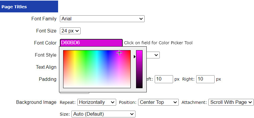
A website's success isn't solely determined by its visual appeal and functionality - it also hinges on how accessible it is to all users, including those with visual impairments. Color contrast is a critical component of web accessibility, as it directly impacts readability and usability. In this article, we will explore the importance of testing color contrast on your website and discuss various tools and methods you can use to
... Continue readingWhat should you watch out for on your website to make sure it is responsive and mobile friendly?
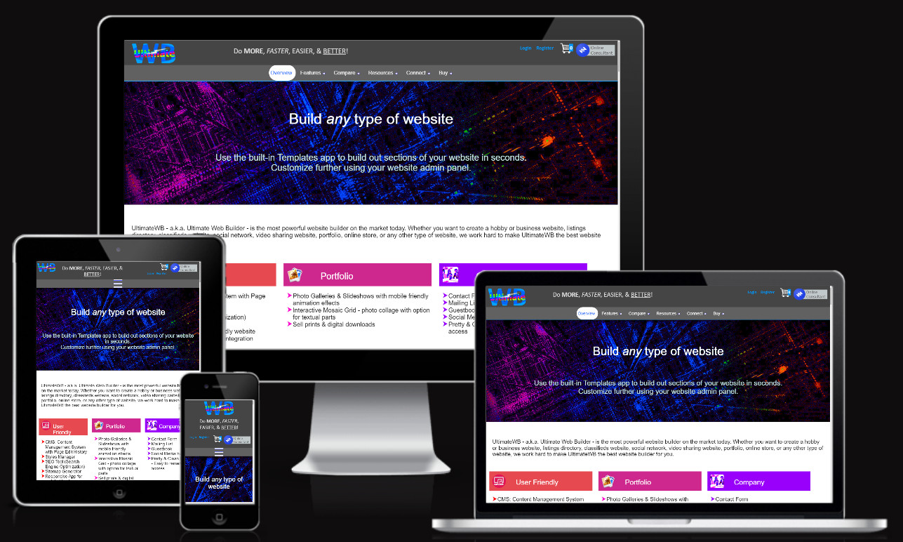
To ensure your website is responsive and mobile-friendly, here are key elements to watch out for and optimize:
Text Fonts and Sizes
Choose fonts that are legible on smaller screens and consider using scalable font sizes. Using the UltimateWB built-in Responsive App (all versions!), you can easily set different font sizes based on viewing screen size. Avoid overly intricate or thin fonts that may become difficult to read on mobile devices. Test different font sizes to find the right balance
... Continue reading
Posted in Website Design
Tagged background images, buttons, contrast, cross browser, device testing, forms, graphics, grids, input fields, interactive elements, media, mobile friendly, navigation menus, page load speed, responsive, responsive layout, text colors, text fonts, text sizes, videos
Leave a comment