



-
Recent Posts
- “My Partner Wants to Use WordPress Because 50% of the Web Uses It. Help!”
- Does EmDash Solve WordPress’s Problems, or Do You Need UltimateWB?
- How Not to Use AI: Stanford University Can Tell You
- Best Website Builder for SEO: WordPress vs. Wix vs. UltimateWB
- How to Make Sure Your Website Colors Have Enough Contrast for Accessibility
- Mobile-Friendly Website Checklist: 20 Things to Check
- Beehiiv Website Builder Review: The Problem Isn’t the Design – It’s the Lack of Control
- Elementor’s “Angie” AI Is More Than Bloat: Credits, Subscriptions, and a Growing Platform Problem
- How to Pass Google Business Profile Video Verification for Service Businesses
- The Great Deskilling: Why AI Dependence is Turning Developers into Prompt Babysitters
- The Three-Month Fuse: The Everest Forms Pro Attack and Why a Patched Plugin Can Still Put Websites at Risk
- Computer Screen Has Black Bars on the Sides: How to Fix It
- Could AI Make Humans Extinct Within the Next Decade?
- Is Weebly Getting Out of the Website-Builder Business?
- Are You “Leaking SEO” by Linking to Other Websites?
- Wix Harmony Is Now in Google Gemini. So Why Are Users Still Complaining?
- When AI Sounds Confident but Gets It Wrong: The Mount Shasta Rescue
- When AI Agents Start Working Together, Who Is Really in Control?
Categories
Tag Archives: visual hierarchy
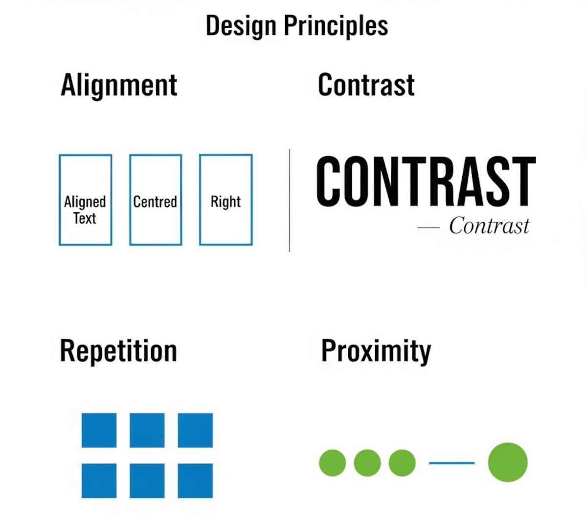
Tutorial: How to Instantly Make Your Designs Look Cleaner

Ever notice how some websites or graphics just feel “off,” even if you can’t put your finger on why? Most of the time, it comes down to a few small mistakes that make a layout look messy. The good news: once you know what to look for, you can fix these issues quickly and make your work look more polished and professional.
Here’s a simple tutorial on the four core principles that will clean up almost any design.
1. Alignment:
... Continue reading
Posted in Website Design
Tagged alignment, avoid clutter, beginner design guide, clarity, clean design, clutter, color, consistency, contrast, design consistency, design hacks, design principles, design repetition, design tricks, design tutorial, fonts, good design, improve website design, layout design, proximity, repetition, spacing, trust, trustworthy, ux design, visual hierarchy, web design tips, white space, whitespace
Leave a comment
Web Design Fundamentals: A Comprehensive Guide

Introduction
Web design is always evolving, combining creativity, usability, and functionality to build websites that are not just visually appealing, but also easy to use and effective. Whether you're a beginner or an experienced designer looking to refine your skills, understanding the fundamentals of web design is crucial. In this guide, we will explore key concepts and best practices that are
... Continue reading
Posted in Website Design
Tagged accessibility, alt text, aria labels, brand identity, branding, build trust, call to action, color psychology, color scheme, color theory, colors, consistency, contrast, contrasting color, cta, digestible content, easy navigation, fast loading times, font sizes, fonts, goals, header tags, headings, line spacing, logo, mobile friendly, paragraph length, purpose, responsive, responsive app, search engine optimization, search engine ranking, seo, short paragraphs, styles manager, subheadings, target audience, typography, user engagement, user experience, user-centered design, user-friendly, ux, ux design, visual hierarchy, website goals, whitespace
Leave a comment
What are some tips for creating an intuitive website layout?

Creating an intuitive website layout is crucial for providing a good user experience and keeping visitors engaged. Here are some tips to help you achieve that:
1. Understand your audience:
- Who are you designing for? What are their needs and expectations? Knowing your target audience helps you prioritize information and functionalities.
2. Prioritize clarity and simplicity:
- Keep the layout clean and uncluttered. Avoid overwhelming users with too much information or complex navigation. Prioritize the most important content and prioritize ease
How do you use visuals effectively on your website?

Visuals can help visitors understand your website, find important information, and know what to do next. Images, graphics, colors, diagrams, videos, and other visual elements can also make a website more engaging.
The key is to use visuals intentionally rather than simply adding images to fill space.
1. Choose Visuals That Fit Your Brand
Your website's visuals should reinforce your brand's identity and
... Continue reading
Posted in Ask David!, Website Design
Tagged accessibility, branding, captions, fast-loading speed, high-quality images, image optimization, responsive web design, stock photos, user experience, visual design, visual hierarchy, visuals, web design, web graphics, website accessibility, website design, website images, website layout, website usability, website visuals, whitespace
Leave a comment
What are some effective strategies for designing a user-friendly and visually appealing website?

A website can be easy to use without being particularly attractive. It can also look impressive while making visitors work too hard to figure out what they are looking at or where they should go.
Good web design brings the two together.
A visually appealing website should catch attention, communicate the personality of the site, and make the content more
... Continue reading
Posted in Ask David!, Website Design
Tagged a/b testing, accessibility, branding, cms, color, cta, fast-loading times, images, page history tool, personality, seo, storytelling, styles manager, user testing, user-friendly, user-friendly website, visual hierarchy, visual storytelling, visually appealing website, web design, web design tips, website colors, website design, website images, website layout, website typography, website usability
Leave a comment
Website Design Guide: Building a User-Friendly and Engaging Site
"What website design guide is the best strategy?"
This guide offers key principles and best practices to craft a website that excels in both user experience and visual appeal.
1. Planning and Foundation
- Define your goals: What do you want visitors to achieve on your site (e.g., contact you, make a purchase, learn more about your services)?
- Know your audience: Who are you trying to reach? Understanding their needs and online behavior is crucial.
- Content is king: Craft clear,
... Continue reading