


-
Recent Posts
- “My Partner Wants to Use WordPress Because 50% of the Web Uses It. Help!”
- Does EmDash Solve WordPress’s Problems, or Do You Need UltimateWB?
- How Not to Use AI: Stanford University Can Tell You
- Best Website Builder for SEO: WordPress vs. Wix vs. UltimateWB
- How to Make Sure Your Website Colors Have Enough Contrast for Accessibility
- Mobile-Friendly Website Checklist: 20 Things to Check
- Beehiiv Website Builder Review: The Problem Isn’t the Design – It’s the Lack of Control
- Elementor’s “Angie” AI Is More Than Bloat: Credits, Subscriptions, and a Growing Platform Problem
- How to Pass Google Business Profile Video Verification for Service Businesses
- The Great Deskilling: Why AI Dependence is Turning Developers into Prompt Babysitters
- The Three-Month Fuse: The Everest Forms Pro Attack and Why a Patched Plugin Can Still Put Websites at Risk
- Computer Screen Has Black Bars on the Sides: How to Fix It
- Could AI Make Humans Extinct Within the Next Decade?
- Is Weebly Getting Out of the Website-Builder Business?
- Are You “Leaking SEO” by Linking to Other Websites?
- Wix Harmony Is Now in Google Gemini. So Why Are Users Still Complaining?
- When AI Sounds Confident but Gets It Wrong: The Mount Shasta Rescue
- When AI Agents Start Working Together, Who Is Really in Control?
Categories
Tag Archives: clutter
What Makes a Website Design Truly Stand Out in 2026?

We’ve all seen websites that look amazing but don’t perform - and others that are minimal, even plain, yet somehow convert like crazy. So what’s the secret? In 2026, truly standout website design goes beyond looks. It’s about creating an experience that feels personal, fast, and effortless.
Here’s what’s defining great web design in 2026 - and how to make your site part of that next wave.
1. Purpose-Driven Design
Pretty doesn’t equal effective. Every button, image, and line
... Continue reading
Posted in Website Design
Tagged accessibility, accessible websites, authentic design, authenticity, bloat, branding, clarity, clutter, colors, fast website, fonts, high-contrast colors, hover effects, microanimations, microinteractions, minimalist websites, mobile-first design, performance, purpose, real photos, responsive, responsive app, search engine optimization, seo, transitions, typography, UI trends, ux design, web design 2026, web design tips, webp, webp converter, WebP images, website performance, website trends, whitespace
Leave a comment
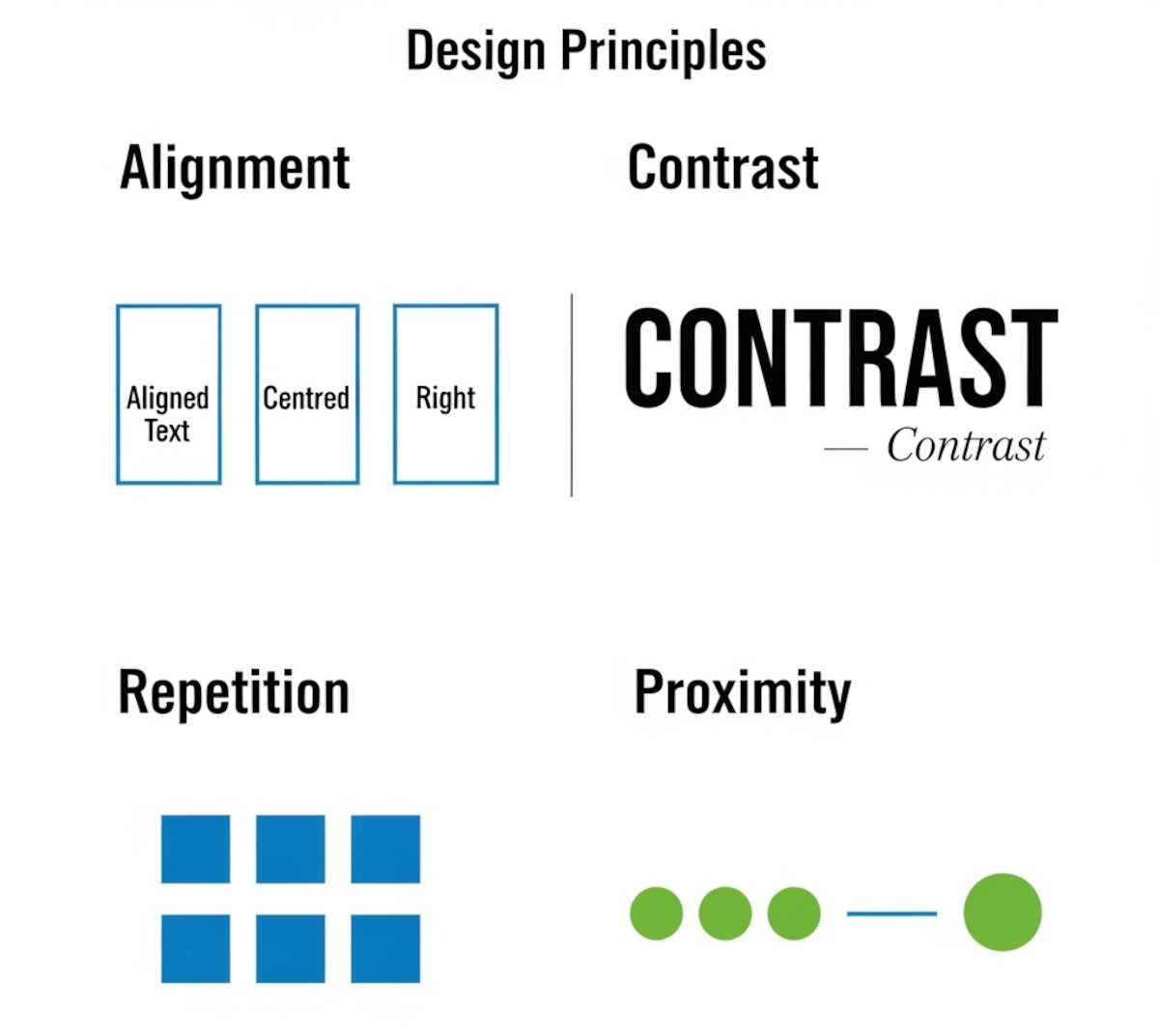
Tutorial: How to Instantly Make Your Designs Look Cleaner

Ever notice how some websites or graphics just feel “off,” even if you can’t put your finger on why? Most of the time, it comes down to a few small mistakes that make a layout look messy. The good news: once you know what to look for, you can fix these issues quickly and make your work look more polished and professional.
Here’s a simple tutorial on the four core principles that will clean up almost any design.
1. Alignment:
... Continue reading
Posted in Website Design
Tagged alignment, avoid clutter, beginner design guide, clarity, clean design, clutter, color, consistency, contrast, design consistency, design hacks, design principles, design repetition, design tricks, design tutorial, fonts, good design, improve website design, layout design, proximity, repetition, spacing, trust, trustworthy, ux design, visual hierarchy, web design tips, white space, whitespace
Leave a comment
From “Wow” to “Wait, What?”: Web Design Trends Already Fading (But Not Gone)

Web design trends evolve rapidly. What felt revolutionary last year can seem outdated today. While these trends weren’t bad - often they were brilliant - the internet moves fast, user expectations shift, and what once excited users can now add unnecessary bloat or fatigue.
Let’s take a look at some recent web design trends that are already fading and why you should approach them cautiously - or use them sparingly.
1. Full-Screen Auto-Playing Hero Video Backgrounds
Why it was popular:
... Continue reading
Posted in Ask David!, Website Design
Tagged accessibility, battery drain, bloat, boost engagement, brand identity, choppy scrolling, clear communication, clutter, core web vitals, emotional connection, fading trends, fast loading times, hero image, hero section, messaging, navigation, novelty, parallax, performance, performance issues, power consumption, scroll-triggered animations, search engine optimization, seo, storytelling, text-only hero section, usability, user expectations, user experience, video backgrounds, web design trends, website performance
Leave a comment
Desktop Web Design: A Forgotten Art?

“Ask David!” question: "What do you think of websites today?"
The Decline of the Desktop Experience
It seems like we've entered an era where mobile design has taken center stage, leaving desktop experiences to fend for themselves. While I appreciate the importance of mobile optimization, I can't help but feel a growing sense of disappointment with the state of desktop design.
The Noise and the Boredom
Many websites today are designed with a mobile-first approach, often resulting in bloated
... Continue readingTop 10 Mistakes That Make Your Website Look Unprofessional

A well-designed website is essential for establishing credibility and attracting customers. However, common mistakes can quickly undermine your professional image. Here are the top 10 pitfalls to avoid:
1. Poor Visual Design:
- Outdated or inconsistent design: Ensure your website's aesthetics are modern and cohesive.
- Low-quality images: Use high-resolution images to avoid pixelation and blurriness.
- Excessive clutter: Keep your layout clean and uncluttered for easy navigation.
2. Slow Loading Times:
- Optimize images: Compress images to reduce file size.
- Minimize code: Remove
Posted in Website Design
Tagged broken links, call to action, clutter, contact information, cta, fast loading times, fast web host, font sizes, font styles, high-quality content, high-quality images, high-quality photos, inconsistent typography, minimize code, mobile friendly, modern, optimize images, outdated, responisve, responsive app, typography, unprofessional, user experience, user friendly, visual design, web design mistakes
Leave a comment
How should a personal website look like?

The design of your personal website depends on a couple of things:
- Your Purpose: What are you using the website for? Are you trying to showcase your work as a freelancer or artist? Are you looking to build a personal brand or online presence? Knowing your goals will influence the kind of content you have and the overall feel of the site.
- Your Audience: Who are you trying to reach with your website? If it's potential employers, you might want
Posted in Ask David!, Website Design
Tagged audience, clean design, clutter, keep is simple, mobile-friendly, navigation, personal website, purpose, responsive, user-friendly, white space
Leave a comment