


-
Recent Posts
- Why AI Builders Become Unaffordable at Scale (And the UltimateWB Alternative)
- Why Is Google Indexing New Blog Posts So Much Slower in 2026?
- Why Does Google Gemini Keep Saying “Something went wrong (1099 or 1076)”?
- What Happened to Reddit? API Changes, Shadowbans, Bots, and Community Decline
- What’s Going On with the Etch WP Team? (Digital Gravy Drama Explained)
- Why is the Discover tab missing now from Google Search Console?
- Big Tech’s New Excuse: The AI Smoke Screen
- WooCommerce Subscriptions Cost: Avoid the $279 Add-On Trap
- The Dogfooding Test: What Happens When Web Platforms Don’t Use Their Own Tools?
- Webflow’s 2026 Layoffs Exposed the SaaS Illusion
- The 2026 Kadence WP Corporate Takeover: What Liquid Web’s Consolidation Means for Your WordPress Website
- Why Windows Suddenly Says “Activate Windows” – And How to Fix It Easily
- How to Restore Accidentally Closed Browser Windows and Tabs
- The Right Way vs. The Wrong Way to Do Programmatic SEO (pSEO)
- Stop Fighting Your Website: Absolute Positioning vs. Fluid Design
- Is Your Google Search Console “Average Position” Lying to You?
- Webflow’s 2026 Price Hike: When “Premium” Means Less Bandwidth
- The WordPress Events Calendar Pro Price Hike – and the Alternative
- How can I avoid “AI SEO sludge”?
- What is the difference between advertising and marketing?
Categories
- Accessibility
- Advertising
- Affiliate Programs
- Announcements
- Apps Comparison
- Ask David!
- Business
- Compare Website Builders
- Computer Tips
- Domain Names
- E-commerce
- Emails
- Facebook Application
- General
- Graphic Design
- Integration Tutorials
- Mailing List Application
- Marketing
- Photos Management
- Search Engine Optimization (SEO)
- Social Media
- Social Networking
- Software Showcase
- Technology in the News
- Traffic Statistics
- Troubleshooting
- Web Content
- Web Hosting
- Website Design
- Website Security
- Website Traffic
- WordPress Customization
Meta
Tag Archives: clean design
Tutorial: How to Instantly Make Your Designs Look Cleaner
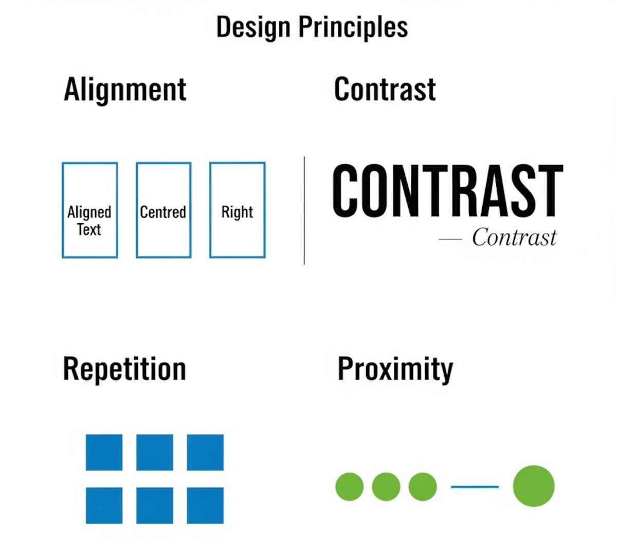
Ever notice how some websites or graphics just feel “off,” even if you can’t put your finger on why? Most of the time, it comes down to a few small mistakes that make a layout look messy. The good news: once you know what to look for, you can fix these issues quickly and make your work look more polished and professional.
Here’s a simple tutorial on the four core principles that will clean up almost any design.
1. Alignment:
... Continue reading
Posted in Website Design
Tagged alignment, avoid clutter, beginner design guide, clarity, clean design, clutter, color, consistency, contrast, design consistency, design hacks, design principles, design repetition, design tricks, design tutorial, fonts, good design, improve website design, layout design, proximity, repetition, spacing, trust, trustworthy, ux design, visual hierarchy, web design tips, white space, whitespace
Leave a comment
How Many Fonts Should Your Website Use – 1, 2, or More?
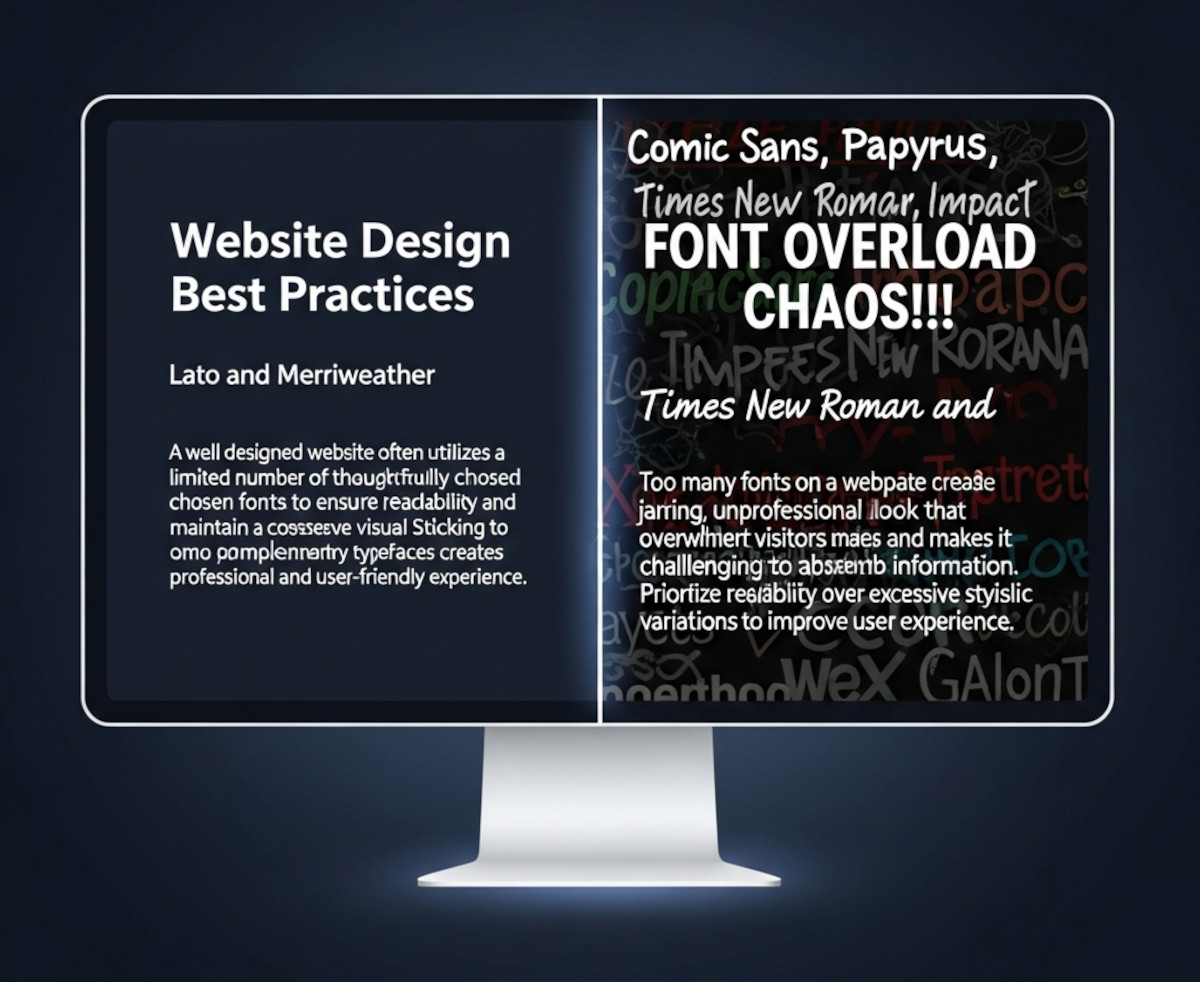
When you’re designing a website, picking fonts can be exciting - maybe too exciting. Suddenly, you’ve got your headline in a funky display font, your body text in something clean and minimal, your call-to-action in a bold condensed typeface, and before you know it… your site looks like a ransom note.
So how many fonts should you actually use on your website? The short answer: usually one or two.
Let’s break it down.
Why Font Restraint Matters
Fonts are more
... Continue reading
Posted in Ask David!, Website Design
Tagged branding, clean design, custom fonts, fast website, font choices, font hierarchy, font pairing, font pairs, font performance, fonts, google fonts, headings, headlines, minimalist design, performance, readability, typography, variable fonts, web design, website design tips, website fonts, website speed
Leave a comment
Do You Really Need a Website to Start a Business in 2025?

These days, it’s not unusual to see people running businesses entirely through social media. Platforms like Instagram, TikTok, and Facebook make it easy to share products, message customers, and even accept payments.
So if that’s possible, is a website still necessary?
This is something a lot of new entrepreneurs are thinking about. And while there’s no one-size-fits-all answer, there are some key reasons many businesses still choose to build a website - whether it’s on day one or
... Continue reading
Posted in Ask David!, Business, Social Media
Tagged backlnks, bloat, boost ranking, branding, build trust, caching, call to action, cdn, clean coding, clean design, credibility, easy navigation, facebook, fast website, google search engine ranking, headings, high-quality content, instagram, keywords, landing page, mobile friendly, responsive, responsive app, scalable, scalable website builder, search engine optimization, seo, social media, tiktok, website speed
Leave a comment
Monster and CareerBuilder File for Bankruptcy – What This Means for Online Job Boards

First the penny is going - and now Monster.
When I first started out as a web developer, Monster.com was one of the first websites I used to look for job opportunities. I remember carefully formatting my resume and uploading it, hoping a recruiter would see it and reach out. It wasn’t perfect or flashy, but it was the go-to site for job seekers at the time.
That news marked the end of an era for one of the internet’s
... Continue readingSingle Space vs. Double Space After a Period: Which Should You Use?
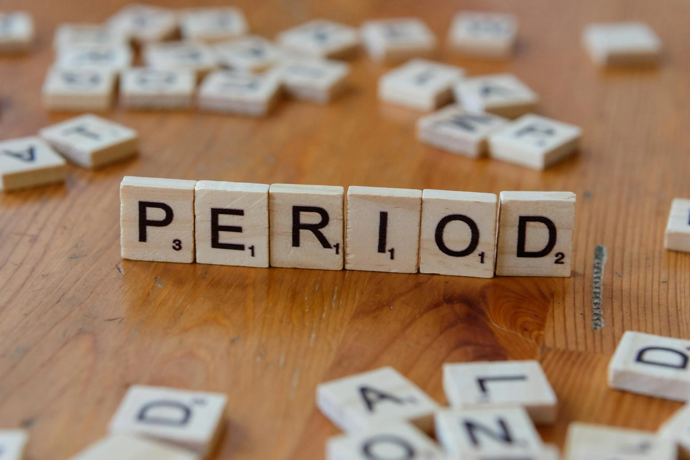
It’s a surprisingly common question among writers, editors, and designers: should you use one space or two after a period?
If you learned to type on a typewriter, you might be used to adding two spaces after a sentence. This convention helped create clearer sentence breaks because typewriters used monospaced fonts - where every character takes up the same amount of space.
But with modern computers and proportional fonts, the need for double spaces has largely disappeared.
Why Single Space
... Continue reading
Posted in Ask David!, Web Content
Tagged apa, branding, chicago manual of style, clean design, clean look, consistent spacing, mla, modern, modern design, modern standard, monospaced fonts, period, readability, sentence breaks, single space vs double space, typewriter, user experience
Leave a comment
How to Create a Website People Will Pay For: A Case Study for a Fitness App

“Ask David!” question: "I'm building a fitness app and want to know how to get people to pay for it. I'm already gathering feedback, using analytics, and iterating quickly. What else can I do to boost conversions?"
This is a common question for many app developers. While building a great fitness app is crucial, it's equally important to convince users to pay for it. Let's explore some strategies to help you achieve this goal.
1. Deepen Your Value Proposition
Posted in Ask David!, Business
Tagged a/b testing, analytics, boost conversions, clean design, content marketing, easy navigation, email marketing, influencer partnerships, intuitive, long-term value, paid advertising, paint point solution, personalized experience, pricing strategy, social media marketing, unique selling point, user experience, user feedback, usp, value proposition
Leave a comment
What are some best practices for designing a homepage that converts visitors into customers?

A homepage that converts visitors into customers should be designed with a clear understanding of your target audience and their needs. Here are some key best practices to follow:
Focus on Value Proposition:
- Clear and Concise Headline: Your headline should immediately communicate what your product or service does and its key benefit to the visitor.
- Benefit-Oriented Content: Instead of technical jargon, explain how your product or service solves the visitor's problem or improves their life.
- Visually Appealing Hero Section: The
Posted in Ask David!, Website Design
Tagged a/b testing, benefit-driven features, benefit-oriented content, call to action, clean design, clean layout, contrast, conversions, cta, fast loading times, headline, hero banner, homepage, mobile friendly, page history tool, simple layout, social proff, technical jargon, testimonials, trust signals, user experience, user friendly, value proposition
Leave a comment
How should a personal website look like?

The design of your personal website depends on a couple of things:
- Your Purpose: What are you using the website for? Are you trying to showcase your work as a freelancer or artist? Are you looking to build a personal brand or online presence? Knowing your goals will influence the kind of content you have and the overall feel of the site.
- Your Audience: Who are you trying to reach with your website? If it's potential employers, you might want
Posted in Ask David!, Website Design
Tagged audience, clean design, clutter, keep is simple, mobile-friendly, navigation, personal website, purpose, responsive, user-friendly, white space
Leave a comment
Website design from decade to decade…

From basic text to bright colors and animations, like the popular dancing baby in 1996, to clean-cut crisp design, website design has evolved significantly over the past several decades. It has come a long way since the first website was launched in 1991, influenced by the advancements in technology, user behavior, and cultural trends.
1990s
In the early days of the World Wide Web, website design was focused on functionality rather than aesthetics. Websites were simple, consisting of text and
... Continue reading
Posted in Website Design
Tagged animations, clean design, decade, high quality images, responsive, user epxerience, user friendly, web design, web styles, website design
Leave a comment