


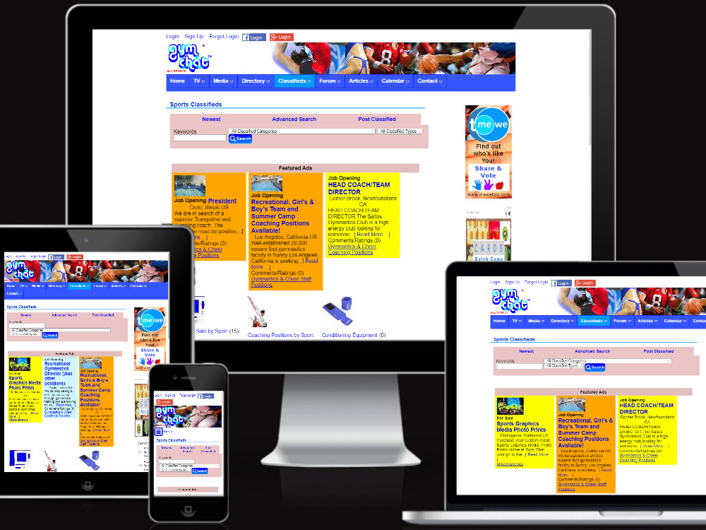
Responsive Check Tool
View your website on multiple devices and check out how responsive your website is! Enter in your website URL below, and choose different devices and screen resolutions to display your website accordingly below. If you are using Ultimate Web Builder software (Promo, PromoU, Essentials+, Lite, and Full from version 3.4+) and have the responsive feature ON, you can view the automatic page reformatting in action here! Ultimate Web Builder software calculates responsive design based on screen resolution, so you can check out the responsive action for a smartphone on your laptop, for example, or even by going to your website and resizing your browser window.
*Note: This does not simulate exactly the user experience on a specific device - for the exact experience, you should check on that specific device. But this does make an excelling testing environment!
We've got new software updates available for download for all versions of Ultimate Web Builder software, UltimateWB 4.3. Updates include new features in the social networking apps, for User Notifications, the Rewards app, and the Timeline app....
We have recently released upgrades for all software versions of Ultimate Web Builder! For a quick summary of what's new, check out the What's New page under the Features tab!
All 5 versions of UltimateWB software have an upgrade to the...
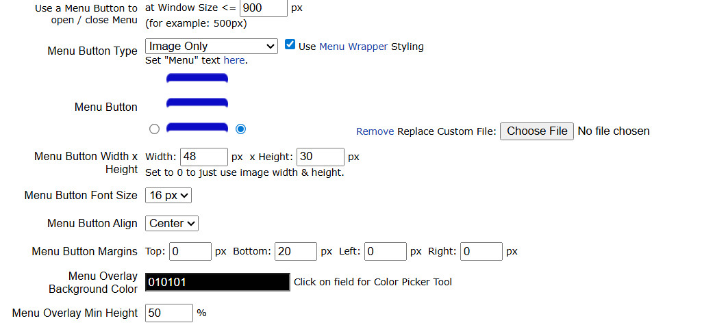
UltimateWB built-in Responsive app, customizing the display of the menu button and menu overlay for mobile and smaller screens.
Make Your Website Responsive - Your Options
You can make your website responsive in several ways:
By coding it...
Should I upgrade my website?
Every dollar matters when you’re building a small business. Early on, it’s natural to look for the fastest and cheapest way to get online, which is why so many businesses start with “basic” website...
Ultimate Web Builder 6 is one of our biggest software upgrades, featuring coding upgrades that will make your website load even faster and a templates generator that will let you build on your website even faster.
All UltimateWB software...
Is your website mobile friendly? If your website is not by this Tuesday you could be dramatically losing traffic to your website from smartphone users! This coming Tuesday Google plans on rolling out their new revised formula in calculating...
You can make sure your website is cross-browser compatible and cross-platform compatible by making it responsive and don't use any incompatible coding. You can do this easily with UltimateWB - it has a built-in responsive app.
Check out...
The Responsive Check Tool available free at UltimateWB.
You can check out how your website looks on various devices with the free UltimateWB Responsive Check Tool.
And actually, if you have created your website with UltimateWB website... Update June 2016: Wix now offers clean & pretty urls to its customers on the main pages, but not all pages like product pages, as noted on their website.
If you choose Wix as your website builder, you will not have the benefit of clean &...
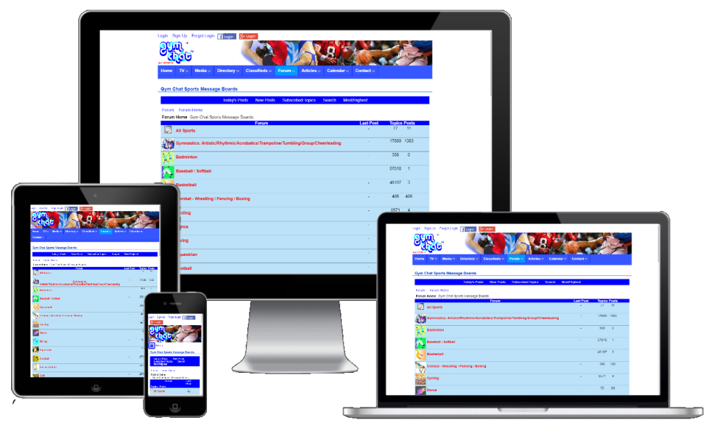
Gym Chat Sports Network messageboards, via the UltimateWB built-in Forum app: Responsive & Mobile Friendly!
UltimateWB - it has a built-in forum app with lots of features, and the styles manager has a responsive app you can activate to make...
The UltimateWB 3.9 software upgrade is available for all 3 versions: Full, Lite, and Essentials+. We have included new built-in apps and new features/upgrades to existing built-in apps.
Traffic and Social Reach are very important for a...
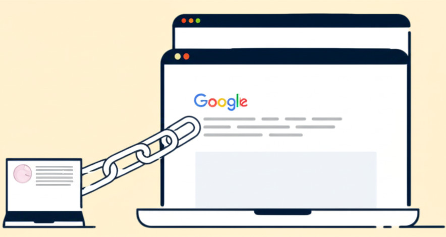
Imagine this: You hire a marketing company to boost your SEO and get your website onto the first page of Google. At first, things seem to be going great - your traffic grows, your site appears near the top for your key search terms, and your...
All the hard work into creating your website, building links to your webpages and celebrating your first page ranking on Google...you don't want to lose all that after switching your web hosting and/or website builder. So how to keep your SEO...
When exploring alternatives to Squarespace, UltimateWB emerges as a top contender, offering a comprehensive solution for creating stunning, feature-rich websites. Here's why UltimateWB stands out:
1. Flexibility:
Unlike Squarespace's...
Looking for the best website builder for SEO? If you want to rank high on Google, the builder you choose can make or break your site’s success. Some make it harder to optimize your site’s performance, speed, and structure. Others require...
Gym Chat sports network classifieds, built on UltimateWB website builder.
Want to build a website like Craigslist or eBay? Whether you’re launching a local classifieds site or a global online marketplace, the software you choose makes all the...
Number 1 one sports fan foam hand with raising forefinger vector icon. Fan support sport illustration
UltimateWB - it has a built-in styles manager, contact form, mailing list app, responsive app, SEO tool, and CMS. You can add a slideshow or... Besides posting your questions on the new Support Forums, you can also browse through helpful website tips! So far, added tips include how to organize your drop down menus so that they are user friendly and how to make your YouTube video embeds... Lots and lots of people use their smartphones for browsing the internet, so you want to make sure to have a mobile website to keep the traffic your are getting. You probably don't need a lot of convincing on that, but you might be wondering, what...
Ultimate Web Builder software 4.7 upgrade has been released and is for all versions.
With all versions of UltimateWB software you can now create a non-scrolling top menu bar - choose when to jump your website menu to the top of the page after...
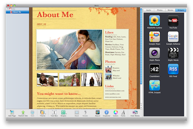
If you haven't heard of iWeb, it may be because of the #1 reason that you shouldn't be using it to create your website:
1) Apple no longer supports iWeb, the website developing creation tool for Mac, and they haven't for a few years now....
A lot of users may go on your website on their smartphones, so it is a good idea for your website to be responsive, i.e. mobile friendly. It will allow users to find what they need fast and easy, rather than leave your website instantly because... UltimateWB software - all versions sincelu UltimateWB 3.4! - come with a built-in Responsive App that can beused to easily create a mobile website in minutes, if not seconds. To easily check how your website looks on different devices/screen... You can download and upgrade your website to Ultimate Web Builder 4.2 now for the latest code updates. If you're hosting with UltimateWB, just email us and we'll take care of the software upgrade for you if you'd like!
We have upgraded the...
We have recently released an upgrade for the Responsive app in UltimateWB Full, Lite, and Essentials+, upgrade 7.2.
If you are using the non-scrolling top menu feature on your website, with the right/left sides content added to the menu bar ,...
You work on your website SEO (search engine optimization), build organic traffic to your website through blog posting, articles, and webpage content, work on your social media, and perhaps purchase some kind of advertising or pass out your... Our special promotional period for downloading UltimateWB Promo free has ended, but you can still buy & download this feature-packed software for as low as $19 for UltimateWB Promo and $34 for UltimateWB Promo Unlimited - only one-time... We have just released Ultimate Web Builder 3.4 with some very exciting new features! The new upgrade makes it very easy to create a high-end website - and mobile website! - without any coding experience!
HTML5 - First we have upgraded UWB to...
"Ask David": "Can you help recommend a drag-and-drop website builder that is not hosted so I can upload HTML to any hosting service?"
Finding a true drag-and-drop website builder that isn’t tied to a hosted platform is surprisingly...
Did you know you can design, build, and manage your website on a mac, pc, or even an ipad / tablet? You can even use a combination of them all - you are not stuck on one computer, or computer type with Ultimate Web Builder software. Because it...
Having your website menu display to the right of your logo is becoming the go-to design choice more and more, so we decided to add this setup as a header template option. Get this 1-click header logo/menu setup with our newest UltimateWB software...
UltimateWB Lite and UltimateWB Full come with a built-in Photo Gallery app, fully customizable.
Are you a photographer, artist, or designer looking for the best website builder to showcase your portfolio professionally and flexibly? Look no...
NOTE: If you are here looking for a dating site to use on your mobile, this isn't the topic, but we know a great one for you, Friends Match Me! It's built on UltimateWB software, with iPhone/iPad and Android apps, and it is the 100% totally...
Warmest wishes for a very happy holiday season and new year!
This year we have upgraded all UltimateWB web hosting packages to include free SSL. If you are hosting your website with UltimateWB and have not yet confirmed you would like the free...
Ultimate Web Builder 4.3 Software Upgrade Available For Download!

UltimateWB software upgrades for all versions released!
How do you make a website responsive (HTML, CSS, and development)?

Your Website is Your Silent Salesperson: Is “Basic” Costing You Money?

UltimateWB 6 is here! Templates generator, contact form app update, and more...

Google To Favor "Mobile Friendly" Websites In Search Starting Tuesday

How can I make my website compatible with all browsers and mobiles?

What is the best way to test responsive web design?

Wix website builder does not offer clean & pretty urls
Which forum software works best for web and mobile apps?

UltimateWB Software 3.9 Upgrade Released!
How Backlinks Can Actually Hurt Your Website’s SEO, Google PageRank, and Traffic

How to switch your web hosting/website builder AND Keep Your SEO/Ranking/Traffic
What is the best alternative to Squarespace?

What’s the Best Website Builder for SEO?
What is the Best Classified Ads Software? Top 5 reasons it is Ultimate Web Builder...

What is the best software for designing a simple personal web page?

Get helpful website creating tips on the Support Forums!

Easiest and Best Way to create your own Mobile Website - go Responsive!

Non-scrolling top menu feature released in UltimateWB 4.7
Still using iWeb? Top 6 reasons you shouldn't be. Upgrade!

How does a mobile-friendly website design increase your conversion rate?

Ultimate Web Builder Responsive Check Tool
Ultimate Web Builder 4.2 Software Upgrade Available For Download!
Responsive App Upgrade!

What cross-browser/cross-platform compatibility means, and why it is important for your website!

UltimateWB Promo software now available for purchase - low-cost website builder with high quality

HTML5, CSS3, Responsive App, Content Editor Upgrades Released in UWB 3.4!

Drag-and-Drop Website Builders You Can Host Anywhere
Build your website on any computer - mac, pc, or even ipad, tablet!
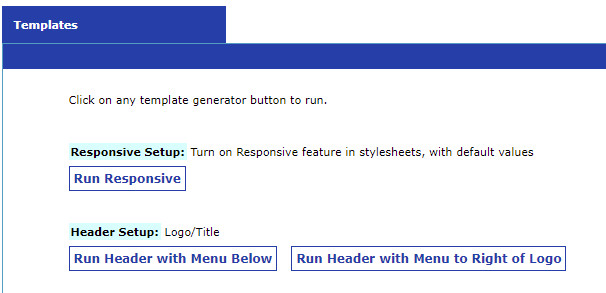
Easy way to display your menu next to your logo on the header

Best Website Builder for Photographers, Artists, and Designers

What is a matching mobile site and how to get one easily?

Happy Holidays!