Make Your Website Responsive – Your Options
You can make your website responsive in several ways:
- By coding it yourself with HTML, CSS, Flexbox, Grid, and media queries.
- By using a responsive template or website builder that handles most of the work for you.
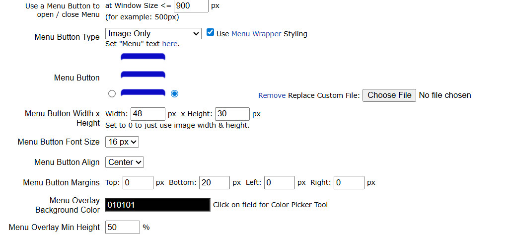
- Or with a platform like UltimateWB that has a built-in Responsive App, letting you customize layouts both without coding and with coding. It’s flexible, scalable, beginner-friendly, yet powerful enough for experts.
This guide will help you understand what responsive design is, explore the no-code options, and show how coding can give you extra control.
What “Responsive” Means
A responsive website automatically adapts its layout and content to fit any screen size. It eliminates horizontal scrolling, broken elements, and awkward resizing, giving users a seamless experience on phones, tablets, and desktops.
With a clear understanding of responsive design, you can choose the approach that fits your skills and goals.
No-Code Approach: Easy and Flexible
If you want to create a responsive website without touching code, modern platforms make it simple:
- UltimateWB: The built-in Responsive App automatically adapts your site across devices while allowing full customization of layouts, spacing, and styling. You can tweak designs visually or add custom code if needed.
- Other builders/templates: Platforms like Wix, Squarespace, and Webflow offer responsive tools and pre-made templates, though customization may be more limited.
No-code tools save time, reduce errors, and are perfect for beginners, yet platforms like UltimateWB are flexible enough for advanced users.
Optional: Coding Your Responsive Website
For those who want complete control, you can make a website responsive manually. Here’s a practical guide:
1. Start with the Viewport Meta Tag
<meta name="viewport" content="width=device-width, initial-scale=1">
This ensures the browser uses the device’s width instead of scaling a desktop layout down.
Related: Why is my website not responsive even if I put the viewport tag in?
2. Use Flexible Layouts
Avoid fixed widths. Use percentages, em, rem, or CSS layout systems like Flexbox or Grid:
.container {
  width: 90%;
  margin: 0 auto;
}

.column {
  flex: 1 1 30%;
}
Columns now grow, shrink, and reflow naturally on different devices.
3. Responsive Images and Media
img {
  max-width: 100%;
  height: auto;
}
Use srcset to serve appropriately sized images for each device, improving load times and performance.
Related: WebP vs. JPG/PNG: Should You Use Fallback Images for Compatibility?
4. Add CSS Media Queries
@media (max-width: 768px) {
  .navigation {
    display: none;
  }
}
You can either think mobile-first – start with phone styles, then add tablet and desktop adjustments – or the other way around.
5. Organize Content Logically
- Use blocks or cards that stack or wrap naturally.
- Flexbox or Grid lets you reorder or resize elements without changing HTML.
This keeps content readable and usable across devices.
6. Optimize Typography and Spacing
- Use
emorremfor font sizes. - Adjust line spacing and margins via media queries.
- Avoid tiny mobile text or oversized desktop text.
Good typography boosts engagement and reduces bounce rates.
Related: How to Keep Bounce Rate in Check? Tips for a Successful Website
Make Your Website Content Skimmable: Boost Engagement and User Experience
The Art of Website Storytelling: How to Captivate Your Audience and Boost Engagement
7. Test Frequently
Check your site on phones, tablets, and desktop screens. Browser developer tools help, but real devices reveal the true user experience.
Tools to Help
- CSS Frameworks: Bootstrap and others provide grid systems and responsive utilities.
- No-Code Platforms: UltimateWB, Wix, Squarespace, Webflow. Among them, UltimateWB’s Responsive App provides automatic adaptation with full customization, making it the best choice for serious website owners.
Why Responsive Design Matters
- Mobile-first users: Most visitors browse on phones or tablets.
- SEO advantage: Google ranks responsive sites higher.
- Better user experience: Easy-to-read, easy-to-navigate layouts increase engagement and conversions.
Related: Website Design Checklist: Boost Conversions and User Experience
Conclusion
Responsive design combines flexible layouts, scalable media, breakpoints, and smart typography. Whether you rely on UltimateWB’s no-code tools or fine-tune manually with HTML and CSS, responsiveness is essential for any modern website. UltimateWB gives you automation for ease, and customization for full control, making it the most flexible and beginner-friendly choice available.
Got a techy/website question? Whether it’s about UltimateWB or another website builder, web hosting, or other aspects of websites, just send in your question in the “Ask David!” form. We will email you when the answer is posted on the UltimateWB “Ask David!” section.


