


-
Recent Posts
- Why AI Builders Become Unaffordable at Scale (And the UltimateWB Alternative)
- Why Is Google Indexing New Blog Posts So Much Slower in 2026?
- Why Does Google Gemini Keep Saying “Something went wrong (1099 or 1076)”?
- What Happened to Reddit? API Changes, Shadowbans, Bots, and Community Decline
- What’s Going On with the Etch WP Team? (Digital Gravy Drama Explained)
- Why is the Discover tab missing now from Google Search Console?
- Big Tech’s New Excuse: The AI Smoke Screen
- WooCommerce Subscriptions Cost: Avoid the $279 Add-On Trap
- The Dogfooding Test: What Happens When Web Platforms Don’t Use Their Own Tools?
- Webflow’s 2026 Layoffs Exposed the SaaS Illusion
- The 2026 Kadence WP Corporate Takeover: What Liquid Web’s Consolidation Means for Your WordPress Website
- Why Windows Suddenly Says “Activate Windows” – And How to Fix It Easily
- How to Restore Accidentally Closed Browser Windows and Tabs
- The Right Way vs. The Wrong Way to Do Programmatic SEO (pSEO)
- Stop Fighting Your Website: Absolute Positioning vs. Fluid Design
- Is Your Google Search Console “Average Position” Lying to You?
- Webflow’s 2026 Price Hike: When “Premium” Means Less Bandwidth
- The WordPress Events Calendar Pro Price Hike – and the Alternative
- How can I avoid “AI SEO sludge”?
- What is the difference between advertising and marketing?
Categories
- Accessibility
- Advertising
- Affiliate Programs
- Announcements
- Apps Comparison
- Ask David!
- Business
- Compare Website Builders
- Computer Tips
- Domain Names
- E-commerce
- Emails
- Facebook Application
- General
- Graphic Design
- Integration Tutorials
- Mailing List Application
- Marketing
- Photos Management
- Search Engine Optimization (SEO)
- Social Media
- Social Networking
- Software Showcase
- Technology in the News
- Traffic Statistics
- Troubleshooting
- Web Content
- Web Hosting
- Website Design
- Website Security
- Website Traffic
- WordPress Customization
Meta
Tag Archives: modern
Cracker Barrel’s Logo Disaster: How $70 Million and a Little Nostalgia Shook a Southern Icon
Cracker Barrel is an American classic. The rocking chairs on the porch, the old-timey decor, and yes, that iconic “Uncle Herschel” leaning on a barrel - it’s a slice of Southern charm that feels familiar to millions. But earlier this year, the restaurant chain decided it was time for a change. And oh boy, did things go sideways.
The New Logo That Nobody Asked For
In 2025, Cracker Barrel unveiled a brand-new logo. Gone was Uncle Herschel, the friendly mascot
... Continue reading
Posted in Marketing, Social Media, Technology in the News, Website Design
Tagged $70 million logo, brand identity, branding, branding fails, Cracker Barrel, Cracker Barrel controversy, Cracker Barrel logo backlash, Cracker Barrel logo change, Cracker Barrel news 2025, Cracker Barrel rebrand, Cracker Barrel reversal, Cracker Barrel stock drop, customer feedback, iconic logo, Julie Felss Masino, logo, logo change, logo disaster, minimalism, modern, modernization, new logo, nostalgia, public outcry, rebranding, rebranding controversy, social media, tradition, Uncle Herschel, Uncle Herschel logo, user feedback, viral backlash
Leave a comment
Single Space vs. Double Space After a Period: Which Should You Use?
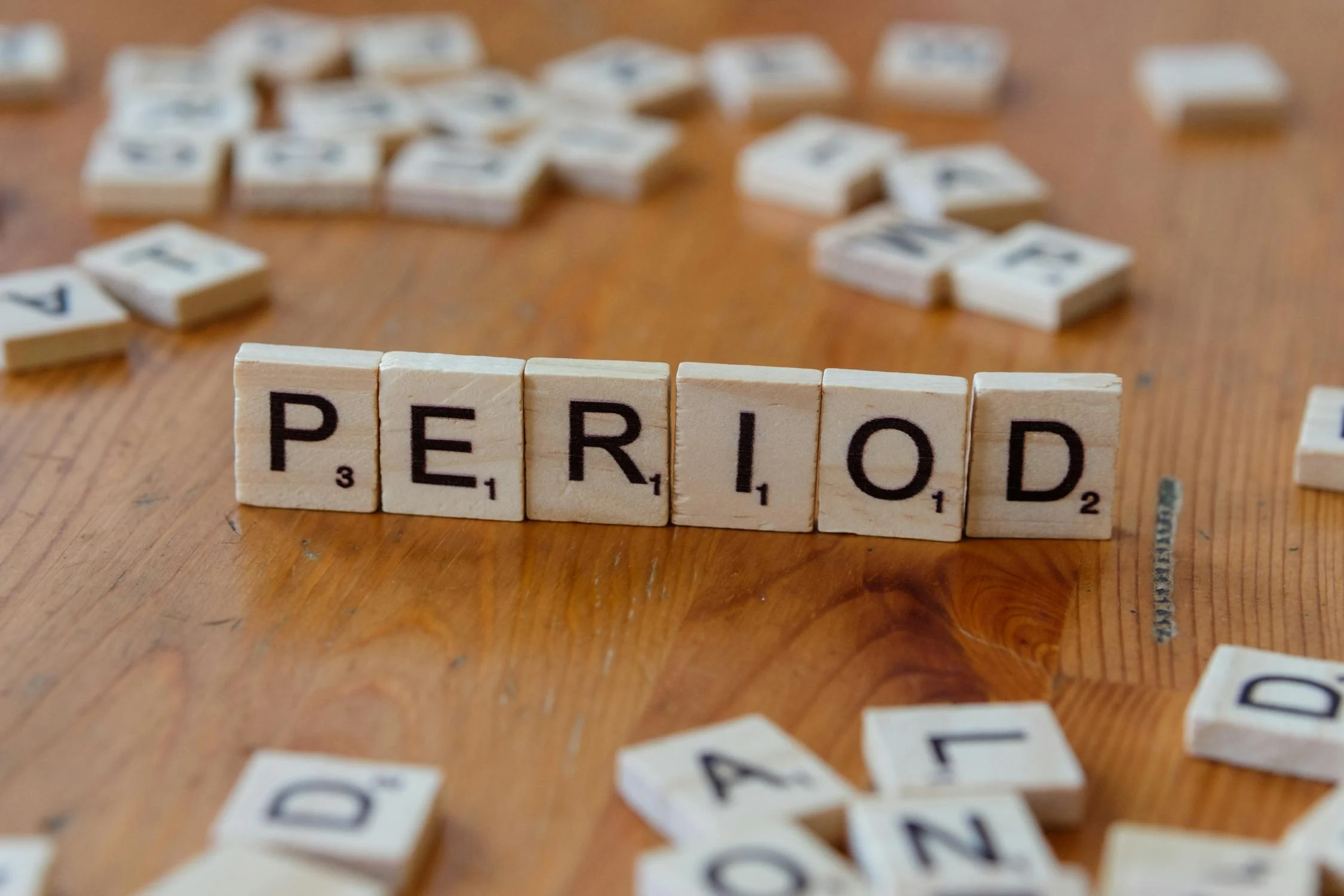
It’s a surprisingly common question among writers, editors, and designers: should you use one space or two after a period?
If you learned to type on a typewriter, you might be used to adding two spaces after a sentence. This convention helped create clearer sentence breaks because typewriters used monospaced fonts - where every character takes up the same amount of space.
But with modern computers and proportional fonts, the need for double spaces has largely disappeared.
Why Single Space
... Continue reading
Posted in Ask David!, Web Content
Tagged apa, branding, chicago manual of style, clean design, clean look, consistent spacing, mla, modern, modern design, modern standard, monospaced fonts, period, readability, sentence breaks, single space vs double space, typewriter, user experience
Leave a comment
Struggling to Define Client Brands? Our Step-by-Step Guide for Web Designers and Marketers

🎯 GOAL:
Help the client articulate their brand essence, values, and visual preferences even if they don’t know the right words.
🧩 Step 1: Ask Simple, Relatable Questions
Ditch design jargon. Speak their language.
- "If your brand were a person, how would you describe them?"
(e.g., bold, trustworthy, calm, fun)
→ Designers translate this into tone, fonts, and color palettes. - "What kind of vibe do you want people to get when they see your site?"
(e.g., luxury, friendly, cutting-edge,
Posted in Marketing, Website Design
Tagged bold, brand mission, brand personality, brand voice, branding, color palette, edgy, font, font choice, inviting, logo, logo design, modern, monimalist, tone, vibe, voice, warm
Leave a comment
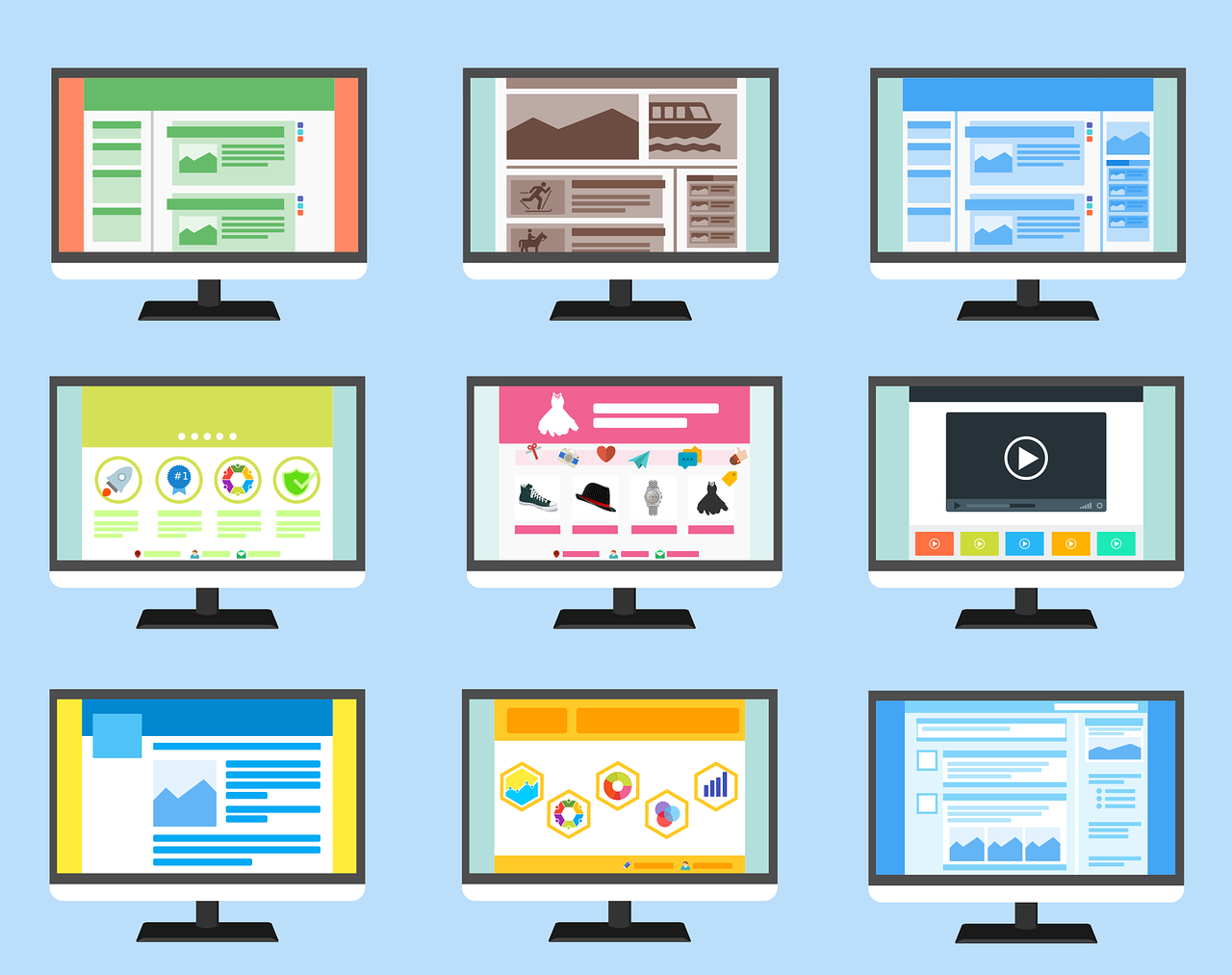
Top 10 Mistakes That Make Your Website Look Unprofessional

A well-designed website is essential for establishing credibility and attracting customers. However, common mistakes can quickly undermine your professional image. Here are the top 10 pitfalls to avoid:
1. Poor Visual Design:
- Outdated or inconsistent design: Ensure your website's aesthetics are modern and cohesive.
- Low-quality images: Use high-resolution images to avoid pixelation and blurriness.
- Excessive clutter: Keep your layout clean and uncluttered for easy navigation.
2. Slow Loading Times:
- Optimize images: Compress images to reduce file size.
- Minimize code: Remove
Posted in Website Design
Tagged broken links, call to action, clutter, contact information, cta, fast loading times, fast web host, font sizes, font styles, high-quality content, high-quality images, high-quality photos, inconsistent typography, minimize code, mobile friendly, modern, optimize images, outdated, responisve, responsive app, typography, unprofessional, user experience, user friendly, visual design, web design mistakes
Leave a comment
Can specific colors or color schemes make a website appear outdated or less modern?
Absolutely! Certain color schemes can significantly impact a website's perceived modernity or outdatedness. Here are some factors to consider:
Outdated Color Schemes:
- Bright, neon colors: These were popular in the 90s and early 2000s but are now considered outdated and can make a website feel dated. Unless you are Nickelodeon. Sponge Bob Square Pants!
- Large, contrasting color blocks: While they were once used for emphasis, they can now appear amateurish and overwhelming.
- Overuse of gradients: Gradients were popular for
Posted in Ask David!, Website Design
Tagged bright colors, color scheme, colors, complementary color pairs, contrasting color blocks, earth tones, gradients, modern, modern color scheme, monochromatic palettes, natural colors, neon colors, nickelodeon, organic feel, outdated, outdated color scheme, pastel tones, sponge bob square pants
Leave a comment