


-
Recent Posts
- “My Partner Wants to Use WordPress Because 50% of the Web Uses It. Help!”
- Does EmDash Solve WordPress’s Problems, or Do You Need UltimateWB?
- How Not to Use AI: Stanford University Can Tell You
- Best Website Builder for SEO: WordPress vs. Wix vs. UltimateWB
- How to Make Sure Your Website Colors Have Enough Contrast for Accessibility
- Mobile-Friendly Website Checklist: 20 Things to Check
- Beehiiv Website Builder Review: The Problem Isn’t the Design – It’s the Lack of Control
- Elementor’s “Angie” AI Is More Than Bloat: Credits, Subscriptions, and a Growing Platform Problem
- How to Pass Google Business Profile Video Verification for Service Businesses
- The Great Deskilling: Why AI Dependence is Turning Developers into Prompt Babysitters
- The Three-Month Fuse: The Everest Forms Pro Attack and Why a Patched Plugin Can Still Put Websites at Risk
- Computer Screen Has Black Bars on the Sides: How to Fix It
- Could AI Make Humans Extinct Within the Next Decade?
- Is Weebly Getting Out of the Website-Builder Business?
- Are You “Leaking SEO” by Linking to Other Websites?
- Wix Harmony Is Now in Google Gemini. So Why Are Users Still Complaining?
- When AI Sounds Confident but Gets It Wrong: The Mount Shasta Rescue
- When AI Agents Start Working Together, Who Is Really in Control?
Categories
Tag Archives: nickelodeon
Can specific colors or color schemes make a website appear outdated or less modern?
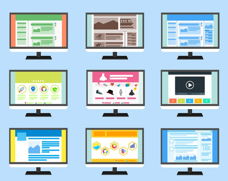
Absolutely! Certain color schemes can significantly impact a website's perceived modernity or outdatedness. Here are some factors to consider:
Outdated Color Schemes:
- Bright, neon colors: These were popular in the 90s and early 2000s but are now considered outdated and can make a website feel dated. Unless you are Nickelodeon. Sponge Bob Square Pants!
- Large, contrasting color blocks: While they were once used for emphasis, they can now appear amateurish and overwhelming.
- Overuse of gradients: Gradients were popular for
Posted in Ask David!, Website Design
Tagged bright colors, color scheme, colors, complementary color pairs, contrasting color blocks, earth tones, gradients, modern, modern color scheme, monochromatic palettes, natural colors, neon colors, nickelodeon, organic feel, outdated, outdated color scheme, pastel tones, sponge bob square pants
Leave a comment