


-
Recent Posts
- Is WordPress Insecure and Slow Because It Uses PHP?
- “My Partner Wants to Use WordPress Because 50% of the Web Uses It. Help!”
- Does EmDash Solve WordPress’s Problems, or Do You Need UltimateWB?
- How Not to Use AI: Stanford University Can Tell You
- Best Website Builder for SEO: WordPress vs. Wix vs. UltimateWB
- How to Make Sure Your Website Colors Have Enough Contrast for Accessibility
- Mobile-Friendly Website Checklist: 20 Things to Check
- Beehiiv Website Builder Review: The Problem Isn’t the Design – It’s the Lack of Control
- Elementor’s “Angie” AI Is More Than Bloat: Credits, Subscriptions, and a Growing Platform Problem
- How to Pass Google Business Profile Video Verification for Service Businesses
- The Great Deskilling: Why AI Dependence is Turning Developers into Prompt Babysitters
- The Three-Month Fuse: The Everest Forms Pro Attack and Why a Patched Plugin Can Still Put Websites at Risk
- Computer Screen Has Black Bars on the Sides: How to Fix It
- Could AI Make Humans Extinct Within the Next Decade?
- Is Weebly Getting Out of the Website-Builder Business?
- Are You “Leaking SEO” by Linking to Other Websites?
- Wix Harmony Is Now in Google Gemini. So Why Are Users Still Complaining?
- When AI Sounds Confident but Gets It Wrong: The Mount Shasta Rescue
Categories
Search Results for: color palette
How to Make Sure Your Website Colors Have Enough Contrast for Accessibility

Choosing colors for a website is not just about whether they look good together. Your text, backgrounds, links, buttons, and other elements also need enough contrast to remain readable and distinguishable.
A color combination that looks perfectly clear on your monitor may be difficult for someone else to read, especially for people with low vision or color vision deficiencies.
Here are some practical things to check when choosing and reviewing your website colors.
1. Check the contrast between text and
... Continue readingWhat colors evoke what emotions?

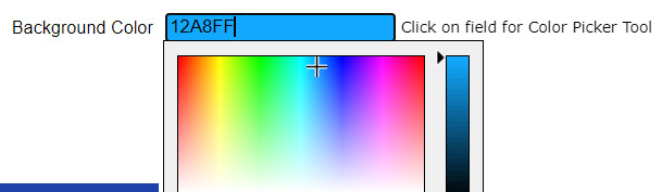
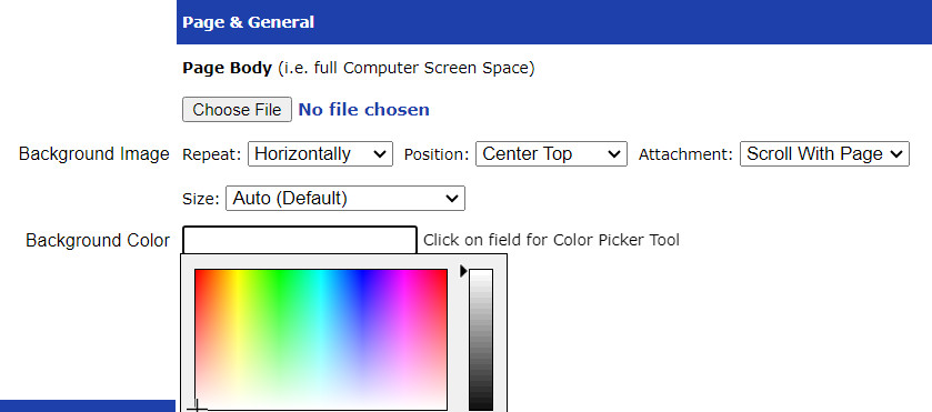
Color palettes can be a very important topic to consider and contemplate when designing your website! One of the great things about UltimateWB website builder is the built-in Styles Manager - it makes choosing colors for your website fun and easy.
Check out this summary we created on the psychology of color, with specifics!
The Psychology of Color: What Different Colors Represent and Evoke
Color plays a powerful role in how we perceive and
... Continue reading
Posted in Ask David!, Marketing, Website Design
Tagged attention, balance, black, blue, calm, color palette, color picker, color psychology, color schemes, compassion, creativity, energy, enthusiasm, evoke emotions, gray, green, growth, happiness, luxury, orange, passion, pink, playfulness, power, professionalism, purple, red, sophistication, styles manager, tranquility, trust, warmth, yellow
Leave a comment
How Color Psychology Affects Web Design & Conversions

When it comes to web design, color is more than just an aesthetic choice - it's a powerful tool that can influence user behavior and, ultimately, conversion rates. Understanding color psychology can help you create a website that not only looks appealing but also drives users to take action.
The Science Behind Color Psychology
Color psychology is the study of how colors affect human behavior. Different colors evoke different emotions and responses. For example, blue is often associated with trust
... Continue readingCan specific colors or color schemes make a website appear outdated or less modern?
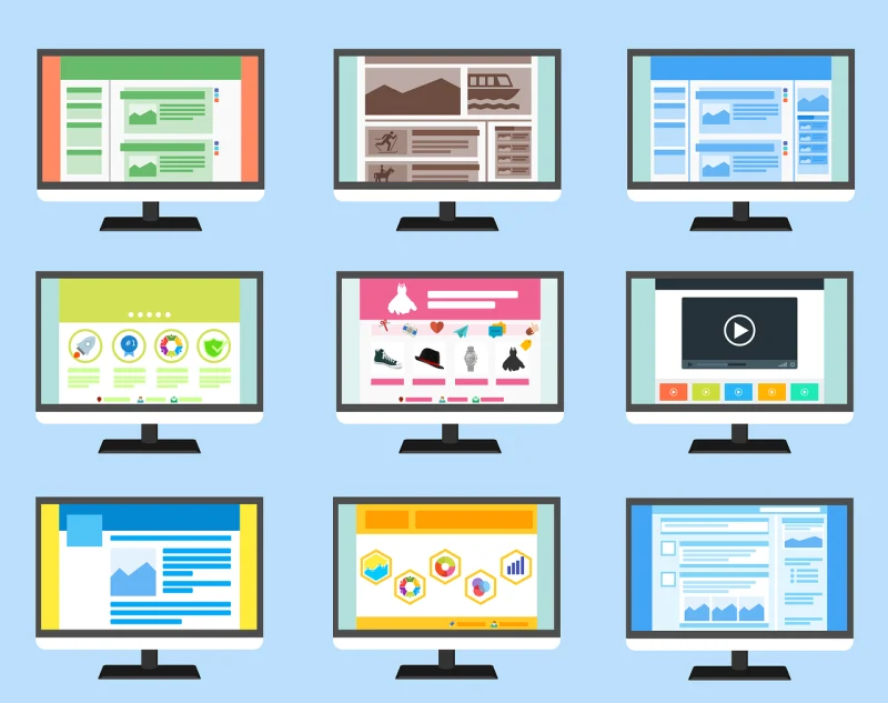
Absolutely! Certain color schemes can significantly impact a website's perceived modernity or outdatedness. Here are some factors to consider:
Outdated Color Schemes:
- Bright, neon colors: These were popular in the 90s and early 2000s but are now considered outdated and can make a website feel dated. Unless you are Nickelodeon. Sponge Bob Square Pants!
- Large, contrasting color blocks: While they were once used for emphasis, they can now appear amateurish and overwhelming.
- Overuse of gradients: Gradients were popular for
Posted in Ask David!, Website Design
Tagged bright colors, color scheme, colors, complementary color pairs, contrasting color blocks, earth tones, gradients, modern, modern color scheme, monochromatic palettes, natural colors, neon colors, nickelodeon, organic feel, outdated, outdated color scheme, pastel tones, sponge bob square pants
Leave a comment
How can I choose the right colors for my brand if I lack experience in design?

Don't worry! Choosing the right brand colors doesn't require expert design skills. You can play around with it and create different stylesheets easily with UltimateWB and the built-in Styles Manager, so the process can even be fun and headache-free. Here are some tips to help you make an informed decision even if you're new to the world of design:
1. Understand your brand:
- What are your brand's
Looking for a Website Builder Without AI? Which One Should You Choose?

If you have spent any time recently searching for a way to build a website, you have probably noticed a pattern: almost every major platform is pushing “AI website generators” or “AI website builders.”
They promise you can type in a single prompt and have a complete, published website in thirty seconds. But as hundreds of creators, developers, and small business owners on Reddit and web design forums are pointing out, the reality is rarely that simple.
If you are
... Continue reading
Posted in AI, Compare Website Builders
Tagged ai costs, AI website builder, all-in-one website builder, backend, backlinks, bloat, brand consistency, brand identity, branding, clean code, colors, control, css, customizable, customization, easy website builder, fast website, flexibility, fonts, high-quality content, html, no ai, ownership, performance, php, Prompt-Based Web Design, saas, server access, subscription fees, third-party plugins, typography, user experience, website builder without ai
Leave a comment
How to Design a Website From Scratch: The Ultimate Guide for Builders

Starting a new web project is an incredible feeling, but it may come with a common challenge: The Blank Canvas Syndrome. When you have the power of a flexible platform like UltimateWB, the possibilities are endless - which might make it harder to pick a direction when you are new to designing.
To build a professional site, you don't need to be an artist. You just need to balance two things: Logic (the technical structure) and Empathy (the human
... Continue reading
Posted in Website Design
Tagged 5-second rule, accessibility, bloat, color contrast, colors, css, easy navigation, empathy, fast website, google search engine ranking, logic, mobile, navigation, ownership, plugin bloat, plugins, responsive, scalability, search engine optimization, seo, third-party plugins, website design, website speed, whitespace
Leave a comment
What Makes a Website Design Truly Stand Out in 2026?

We’ve all seen websites that look amazing but don’t perform - and others that are minimal, even plain, yet somehow convert like crazy. So what’s the secret? In 2026, truly standout website design goes beyond looks. It’s about creating an experience that feels personal, fast, and effortless.
Here’s what’s defining great web design in 2026 - and how to make your site part of that next wave.
1. Purpose-Driven Design
Pretty doesn’t equal effective. Every button, image, and line
... Continue reading
Posted in Website Design
Tagged accessibility, accessible websites, authentic design, authenticity, bloat, branding, clarity, clutter, colors, fast website, fonts, high-contrast colors, hover effects, microanimations, microinteractions, minimalist websites, mobile-first design, performance, purpose, real photos, responsive, responsive app, search engine optimization, seo, transitions, typography, UI trends, ux design, web design 2026, web design tips, webp, webp converter, WebP images, website performance, website trends, whitespace
Leave a comment
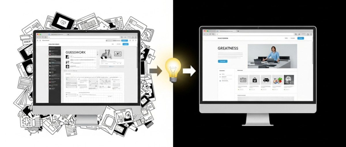
How to Learn Web Design: From Guesswork to Greatness

If you’re just getting started with web design, you might be asking yourself as one “Ask David!” particpant:
Am I just winging it? Are there rules? How do I know if my design actually works - or if it just looks nice?
These are questions almost every new designer has asked, and they’re completely valid. The good news? You don’t have to guess your way through it. While creativity plays a big role, great web design is a craft
... Continue reading
Posted in Ask David!, Website Design
Tagged avoid clutter, behance, branding, call-to-action, clear messaging, clear navigation, color palettes, color psychology, colors, conversions, cta, easy navigation, fast loading times, fast website, flow, fonts, great web design, hierarchy, landing page, learn web design, microinteractions, mobile-friendly, responsive, responsive app, reviews, small animations, social proof, spacing, testimonials, transitions, trust badges, usability, usability testing, user behavior, user experience, ux, web design best practices
Leave a comment
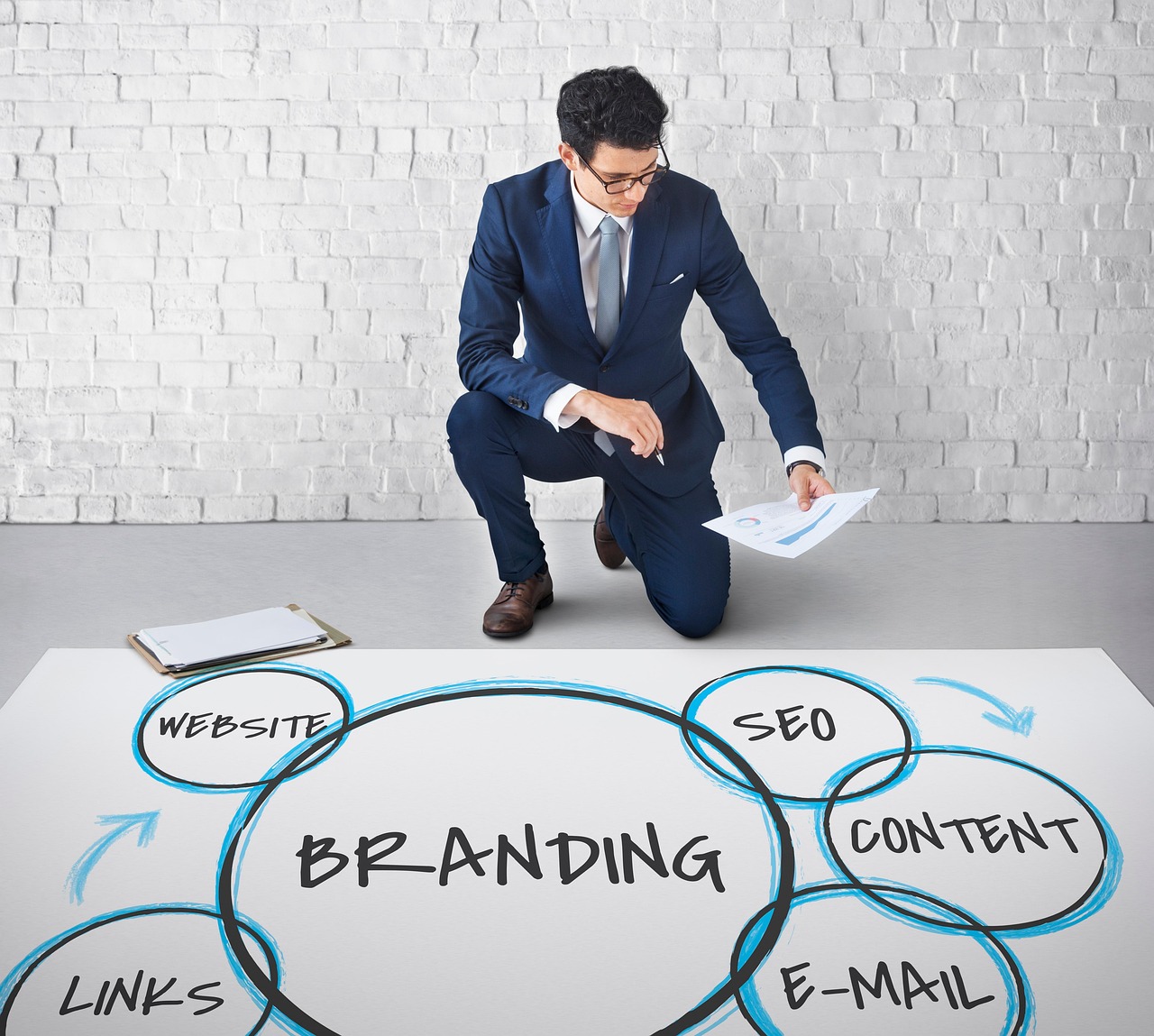
Struggling to Define Client Brands? Our Step-by-Step Guide for Web Designers and Marketers

🎯 GOAL:
Help the client articulate their brand essence, values, and visual preferences even if they don’t know the right words.
🧩 Step 1: Ask Simple, Relatable Questions
Ditch design jargon. Speak their language.
- "If your brand were a person, how would you describe them?"
(e.g., bold, trustworthy, calm, fun)
→ Designers translate this into tone, fonts, and color palettes. - "What kind of vibe do you want people to get when they see your site?"
(e.g., luxury, friendly, cutting-edge,
Posted in Marketing, Website Design
Tagged bold, brand mission, brand personality, brand voice, branding, color palette, edgy, font, font choice, inviting, logo, logo design, modern, monimalist, tone, vibe, voice, warm
Leave a comment