


A website can look great and work well, but if the text is difficult to read because there isn’t enough contrast between the colors, some visitors may struggle to use it.
Color contrast is an important part of website accessibility. Good contrast makes text and other elements easier to see and read, including for people with low vision or color vision deficiencies.
In this article, we’ll look at how to test the color contrast on your website, including online contrast checkers, browser extensions, desktop tools, and automated accessibility testing tools.
If you’re choosing or reviewing your website’s colors and want to know what to check for, see our guide on how to make sure your website colors have enough contrast for accessibility.
Understanding Color Contrast:
Color contrast refers to the difference in luminance (brightness) and color between the foreground (text or graphics) and background on your website. It is a fundamental aspect of accessibility, as it affects the ability of users, including those with low vision or color blindness, to read and interact with your content.
Why Color Contrast Matters:
- Legibility: Proper color contrast ensures that text and elements are easily readable. Inadequate contrast can cause strain and make content illegible, leading to a poor user experience.
- Inclusivity: An accessible website accommodates all users, including those with visual impairments. Meeting color contrast requirements is a fundamental aspect of web inclusivity.
- Compliance: Many countries and regions have web accessibility standards and regulations, such as the Web Content Accessibility Guidelines (WCAG). Ensuring proper color contrast is essential for compliance.
Testing Color Contrast:
- Manual Testing:
- One basic way to test color contrast is to use your own eyes. Ensure that text stands out clearly against its background.
- Test under different lighting conditions, such as bright sunlight or low indoor light, to account for variations in visual perception.
- Online Contrast Checkers:
- Numerous online tools and contrast checkers are available. They allow you to input color values and see if they meet accessibility standards.
- Some popular tools include WebAIM’s Color Contrast Checker and the WAVE Accessibility Evaluation Tool.
- Browser Extensions:
- Browser extensions like “ColorPick Eyedropper” for Chrome or “ColorZilla” for Firefox enable you to select and analyze colors directly on webpages.
- Some extensions also provide contrast ratio information.
- Desktop Software:
- Graphics software like Adobe Photoshop or online design platforms often include built-in contrast analysis tools.
- These tools help web designers and developers ensure the colors they use are accessible.
- Automated Testing Tools:
- Web accessibility testing tools like Axe and Pa11y can automatically check color contrast across your website.
- These tools provide reports and suggestions for improving accessibility.
Common Color Contrast Ratios:
WCAG has different levels of accessibility requirements. Level AA is the commonly used target for websites, while Level AAA has stricter requirements. For color contrast, the key ratios are:
- 4.5:1: This is the minimum contrast ratio for normal-sized text under WCAG AA. Normal-sized text means text smaller than 24px regular or smaller than about 18.5px bold.
- 3:1: This is the minimum contrast ratio for large text under WCAG AA. Large text means at least 24px regular or about 18.5px bold. A 3:1 ratio also applies to user interface components and meaningful graphical objects where WCAG’s non-text contrast requirement applies.
- 7:1: This is the minimum contrast ratio for normal-sized text under WCAG AAA. For large text, WCAG AAA requires a minimum contrast ratio of 4.5:1.
Addressing Color Contrast Issues:
If you discover that your website’s color contrast doesn’t meet accessibility standards, you can take several steps to improve it:
- Adjust the color of text, backgrounds, or elements.
- Increase the font size.
- Use a different font with better contrast characteristics.
- Add a background behind text that appears over an image.
- Test again after making changes to ensure compliance.
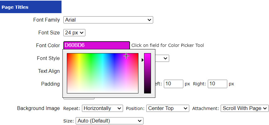
With UltimateWB website builder, you can do this via your website admin panel’s Styles Manager, as well as via the CMS, the Page Editor box on your Add/Edit Pages.
Ensuring proper color contrast is not only a legal requirement in many cases but also a moral obligation to make your website welcoming and usable for all visitors. By following these testing methods and guidelines, you can enhance the accessibility of your website and provide a more inclusive online experience for everyone.
Ready to design & build your own website that meets accessibility standards? Learn more about UltimateWB! We also offer web design packages if you would like your website designed and built for you.
Got a techy/website question? Whether it’s about UltimateWB or another website builder, web hosting, or other aspects of websites, just send in your question in the “Ask David!” form. We will email you when the answer is posted on the UltimateWB “Ask David!” section.