


To ensure your website is responsive and mobile-friendly, here are key elements to watch out for and optimize:
Text Fonts and Sizes
Choose fonts that are legible on smaller screens and consider using scalable font sizes. Using the UltimateWB built-in Responsive App (all versions!), you can easily set different font sizes based on viewing screen size. Avoid overly intricate or thin fonts that may become difficult to read on mobile devices. Test different font sizes to find the right balance between readability and aesthetic appeal.
Text Colors and Contrast
Ensure that text colors have sufficient contrast against the background to make reading effortless. High contrast helps visually impaired users and enhances readability on small screens. Test your text colors on different devices to ensure they remain legible and accessible.
Background Images and Graphics
Optimize background images and graphics to load quickly without compromising quality. Use responsive image techniques to ensure they adapt to different screen sizes and resolutions. Test the placement of text and other content elements to ensure they remain visible and readable against the background.
Navigation Menus
Ensure your navigation menus are mobile-friendly. Consider using a collapsible or hamburger menu icon that expands when tapped. Use clear labels, provide enough space between menu items, and ensure they are easy to tap with a finger. Test the functionality and appearance of your menus on various mobile devices.
Buttons and Interactive Elements
Make sure buttons and interactive elements are large enough and spaced adequately to accommodate touch interactions. Ensure they are visually distinct and easy to tap without accidentally activating adjacent elements. Consider using visual feedback, such as button animations or color changes, to indicate interactions on touch devices. You can set a different text color/background color for buttons from your UltimateWB website admin panel > Styles Manager.
Forms and Input Fields
Optimize forms and input fields for mobile use. Use responsive design techniques to adjust their layout and size according to the device screen. This can automatically be done for your with UltimateWB website builder. Simplify forms by removing unnecessary fields and use appropriate input types, such as date pickers or number fields, to enhance user experience. Test form functionality and ease of use on mobile devices.
Media and Videos
Optimize images, videos, and other media files for mobile devices to reduce loading times. Compress images without sacrificing quality, and consider lazy loading techniques to load media as users scroll. The UltimateWB Timeline app and Messenger app uses this technique to load content in a timely and user-friendly fashion. Ensure videos are responsive and playable on mobile devices, using HTML5 or mobile-friendly video players.
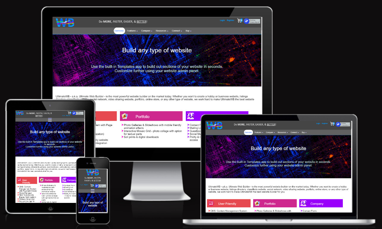
Responsive Layout and Grids
Design your website using responsive layouts and grids that adapt to different screen sizes. Use CSS media queries to apply specific styles based on device characteristics. This is the technique that the UltimateWB built-in Responsive app utilizes. Ensure elements are appropriately aligned and spaced, and consider stacking or rearranging content for smaller screens to maintain readability and visual appeal.
Page Load Speed
Monitor your website’s loading speed, particularly on mobile devices. Optimize code, compress files, and minify CSS and JavaScript to reduce loading times. Prioritize critical content to load first and defer non-essential elements. Regularly test your website’s speed and performance using tools like Google PageSpeed Insights.
Cross-Browser and Device Testing
Thoroughly test your website on different browsers and devices to ensure consistent functionality and appearance. Use responsive design testing tools – such as the UltimateWB Responsive Check Tool – or manually test your website on various smartphones, tablets, and desktops. Pay attention to any layout issues, broken elements, or inconsistencies and make necessary adjustments.
By carefully considering these elements and regularly testing your website on multiple devices, you can ensure it is responsive and mobile-friendly, providing a seamless user experience across all screens.