


-
Recent Posts
- “My Partner Wants to Use WordPress Because 50% of the Web Uses It. Help!”
- Does EmDash Solve WordPress’s Problems, or Do You Need UltimateWB?
- How Not to Use AI: Stanford University Can Tell You
- Best Website Builder for SEO: WordPress vs. Wix vs. UltimateWB
- How to Make Sure Your Website Colors Have Enough Contrast for Accessibility
- Mobile-Friendly Website Checklist: 20 Things to Check
- Beehiiv Website Builder Review: The Problem Isn’t the Design – It’s the Lack of Control
- Elementor’s “Angie” AI Is More Than Bloat: Credits, Subscriptions, and a Growing Platform Problem
- How to Pass Google Business Profile Video Verification for Service Businesses
- The Great Deskilling: Why AI Dependence is Turning Developers into Prompt Babysitters
- The Three-Month Fuse: The Everest Forms Pro Attack and Why a Patched Plugin Can Still Put Websites at Risk
- Computer Screen Has Black Bars on the Sides: How to Fix It
- Could AI Make Humans Extinct Within the Next Decade?
- Is Weebly Getting Out of the Website-Builder Business?
- Are You “Leaking SEO” by Linking to Other Websites?
- Wix Harmony Is Now in Google Gemini. So Why Are Users Still Complaining?
- When AI Sounds Confident but Gets It Wrong: The Mount Shasta Rescue
- When AI Agents Start Working Together, Who Is Really in Control?
Categories
Category Archives: Website Design
Is inline CSS better or using a stylesheet?

Short answer: Stylesheet! Reasons: Improved Performance, Enhanced Maintainability, Better Organization, SEO Benefits.
Longer answer...
The Myth of Inline CSS: Why Separate Stylesheets are SuperiorIntroduction
In the realm of web development, there's a persistent misconception that inline CSS is the fastest and most efficient way to style web pages. This belief often leads to practices that can actually hinder performance and make code more difficult to maintain. In this article, we'll debunk the myth of inline CSS and explore the
... Continue readingWeb Design Fundamentals: A Beginner’s Guide

Introduction
Web design is the art and science of creating websites. It involves planning, creating, and maintaining websites. If you're interested in learning web design, this guide will provide you with the fundamental concepts and tools to get started. Click on the links for more discussion on the topic.
Core Principles of Web Design
- User Experience (UX): The focus should be on creating a seamless and intuitive experience for users.
Posted in Website Design
Tagged accessibility, adobe photoshop, atom, avoid clutter, cms, code editors, color theory, colors, content is king, create a mood, css, custom code, custom fonts, design tools, evoke emotions, Figma, fixed, fluid, fonts, grid, hierarchy, high-quality content, html, illustrator, javascript, keep it simple, keywords, layout, navigation, readability, responisve, responsive, responsive app, search engine optimization, seo, seo tips, styles manager, stylesheet, sublime text, typography, user experience, user interface, ux, visual appear, visual studio code, wcag, web content accessibility guidelines, web design trends, whitespace
Leave a comment
Pro Web Design Tip: Avoid Overdoing Animated Sections

Animation can be a powerful tool to enhance your website’s visual appeal and user engagement. When used judiciously, it can add depth, dynamism, and a sense of interactivity.
But there's a fine line between making a visitor think “Wow, that's cool” and making them think “Okay, I need to get out of here.”
Too much movement can be distracting, overwhelming, and make it harder for visitors to focus on what actually matters on the page.
We have been noticing excessive
... Continue readingThe Comeback of Maximalism: A Bold New Era for Web Design
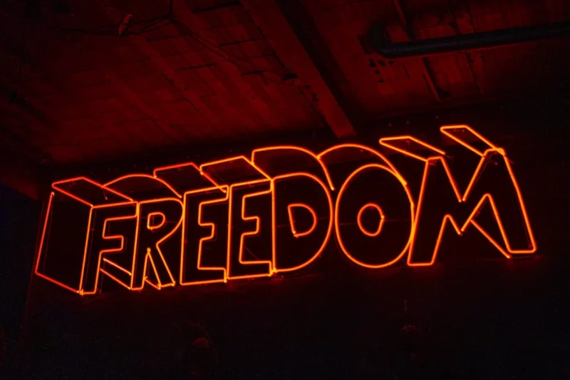
The Minimalist Movement has dominated the design world for years, championing clean lines, simple layouts, and a focus on negative space. But as with all trends, a shift is afoot. Maximalism is making a triumphant return, promising a bold, vibrant, and expressive new era for web design.
What is Maximalism?
Maximalism is the antithesis of minimalism. It embraces abundance, complexity, and ornamentation. Think
... Continue reading
Posted in Website Design
Tagged bold typography, brand differentiation, branding, cluttered design, color palette, custom fonts, emotional connection, freedom to design, intricate patterns, maximalism, minimalism vs maximalism, minimalist design, styles manager, user experience, vibrant colors, visually appealing design
Leave a comment
Why do many Japanese websites maintain a design aesthetic that appears “90s or early 2000s” to Western eyes, while Western websites often embrace minimalist design trends?

Minimalism vs maximalism web design...You like what you like, right?!
The minimalist design aesthetic, popular in Western design, often finds less traction in Japanese websites. This can be attributed to several cultural and historical factors:
- Cultural Appreciation for Detail: Japanese culture often values meticulousness and attention to detail. Minimalism, with its emphasis on simplicity and reduction, can sometimes be seen as lacking in depth or nuance.
- Historical Influence: Japan's rich history, including periods like Edo, has influenced a design aesthetic
Posted in Ask David!, Website Design
Tagged 2000s website design, 90s website design, appreciation for detail, complex layouts, cultural nuances, cultural perspective, detailed designs, edo, elaborate designs, hierarchical structure, japanese consumers, Japanese websites, market preferences, minimalism vs maximalism, minimalist design, minimalist principles, minimalistic website design, negative space, symbolism, targeting international audiences, western design trends, western markets, western web design
Leave a comment
How long is too long for a website homepage?

The ideal length for a website homepage depends on several factors:
- Purpose of the website: A website with a single-page application (SPA) might have a longer homepage, while a traditional website with multiple pages might have a shorter homepage.
- Content: The amount and complexity of content will determine the length. A website with a lot of information or multimedia might require a longer homepage.
- User experience: A long homepage can be overwhelming for users. It's important to break up
Posted in Ask David!, Website Design
Tagged clear, clear content, didn't read, headings, homepage, multi-page website, one-page website, page length, read more, subheadings, too long, user experience, visuals
Leave a comment
What colors evoke what emotions?

Color palettes can be a very important topic to consider and contemplate when designing your website! One of the great things about UltimateWB website builder is the built-in Styles Manager - it makes choosing colors for your website fun and easy.
Check out this summary we created on the psychology of color, with specifics!
The Psychology of Color: What Different Colors Represent and Evoke
Color plays a powerful role in how we perceive and
... Continue reading
Posted in Ask David!, Marketing, Website Design
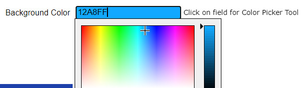
Tagged attention, balance, black, blue, calm, color palette, color picker, color psychology, color schemes, compassion, creativity, energy, enthusiasm, evoke emotions, gray, green, growth, happiness, luxury, orange, passion, pink, playfulness, power, professionalism, purple, red, sophistication, styles manager, tranquility, trust, warmth, yellow
Leave a comment
How Color Psychology Affects Web Design & Conversions

When it comes to web design, color is more than just an aesthetic choice - it's a powerful tool that can influence user behavior and, ultimately, conversion rates. Understanding color psychology can help you create a website that not only looks appealing but also drives users to take action.
The Science Behind Color Psychology
Color psychology is the study of how colors affect human behavior. Different colors evoke different emotions and responses. For example, blue is often associated with trust
... Continue readingTop 10 Mistakes That Make Your Website Look Unprofessional

A well-designed website is essential for establishing credibility and attracting customers. However, common mistakes can quickly undermine your professional image. Here are the top 10 pitfalls to avoid:
1. Poor Visual Design:
- Outdated or inconsistent design: Ensure your website's aesthetics are modern and cohesive.
- Low-quality images: Use high-resolution images to avoid pixelation and blurriness.
- Excessive clutter: Keep your layout clean and uncluttered for easy navigation.
2. Slow Loading Times:
- Optimize images: Compress images to reduce file size.
- Minimize code: Remove
Posted in Website Design
Tagged broken links, call to action, clutter, contact information, cta, fast loading times, fast web host, font sizes, font styles, high-quality content, high-quality images, high-quality photos, inconsistent typography, minimize code, mobile friendly, modern, optimize images, outdated, responisve, responsive app, typography, unprofessional, user experience, user friendly, visual design, web design mistakes
Leave a comment
Can specific colors or color schemes make a website appear outdated or less modern?
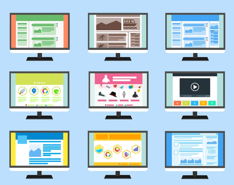
Absolutely! Certain color schemes can significantly impact a website's perceived modernity or outdatedness. Here are some factors to consider:
Outdated Color Schemes:
- Bright, neon colors: These were popular in the 90s and early 2000s but are now considered outdated and can make a website feel dated. Unless you are Nickelodeon. Sponge Bob Square Pants!
- Large, contrasting color blocks: While they were once used for emphasis, they can now appear amateurish and overwhelming.
- Overuse of gradients: Gradients were popular for
Posted in Ask David!, Website Design
Tagged bright colors, color scheme, colors, complementary color pairs, contrasting color blocks, earth tones, gradients, modern, modern color scheme, monochromatic palettes, natural colors, neon colors, nickelodeon, organic feel, outdated, outdated color scheme, pastel tones, sponge bob square pants
Leave a comment