


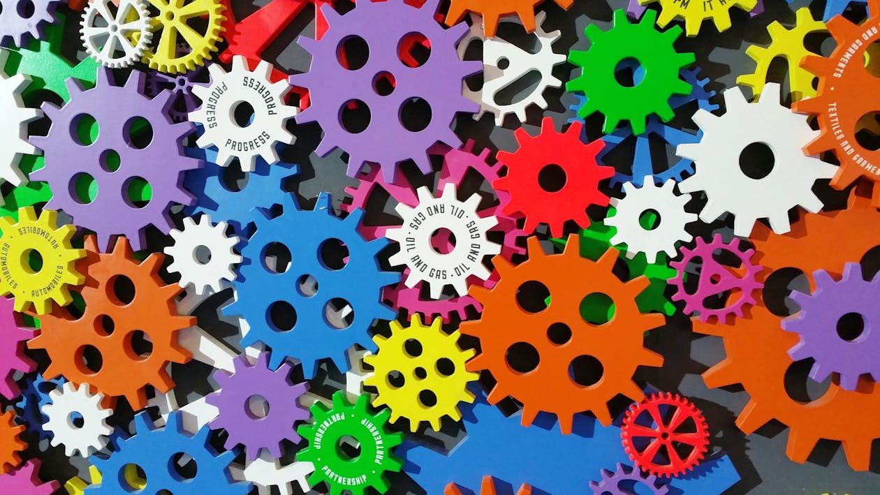
Animation can be a powerful tool to enhance your website’s visual appeal and user engagement. When used judiciously, it can add depth, dynamism, and a sense of interactivity.
But there’s a fine line between making a visitor think “Wow, that’s cool” and making them think “Okay, I need to get out of here.”
Too much movement can be distracting, overwhelming, and make it harder for visitors to focus on what actually matters on the page.
We have been noticing excessive animation on many Squarespace websites in particular, and it can quickly hinder the overall user experience.
Here are some tips for using animated sections effectively:
Less Is More
Avoid overwhelming your visitors with a barrage of animations. Use them sparingly to highlight key elements or to create a sense of transition between sections.
If everything is moving, nothing really stands out.
Focus on Functionality
Ensure that your animations serve a purpose. They should enhance the user experience, not detract from it.
For example, use animations to reveal hidden content or to guide users through a complex process. Don’t add an effect simply because the effect is available.
Consider Loading Times
Excessive animations can slow down page loading times, especially on slower internet connections. Optimize your animations to ensure that they load quickly and don’t hinder the user experience.
A beautiful animation isn’t doing much for your website if visitors are waiting for the page to load.
Test on Different Devices
Ensure that your animations are compatible with different devices and screen sizes. A smooth animation on a desktop might appear choppy on a mobile device.
What looks great on a large monitor can be a very different experience on a phone.
Prioritize Accessibility
Make sure your animations are accessible to all users, including those with disabilities. Some visitors may be sensitive to motion or prefer reduced movement.
Provide appropriate alternatives or controls where needed, and don’t let animation interfere with someone’s ability to read or navigate your website.
The goal isn’t to eliminate animation from web design. It’s to use it where it adds something to the experience.
The best animated sections are the ones that make a website feel more engaging without making visitors work harder to use it.
Related Articles:
What Makes a Website Design Truly Stand Out in 2026?
Website Design Guide: Building a User-Friendly and Engaging Site
How to make your website load faster?
How do I ensure that the site I build is UX-based and responsive?
Ready to design & build your own website? Learn more about UltimateWB! We also offer web design packages if you would like your website designed and built for you.
Got a techy/website question? Whether it’s about UltimateWB or another website builder, web hosting, or other aspects of websites, just send in your question in the “Ask David!” form. We will email you when the answer is posted on the UltimateWB “Ask David!” section.