





-
Recent Posts
- “My Partner Wants to Use WordPress Because 50% of the Web Uses It. Help!”
- Does EmDash Solve WordPress’s Problems, or Do You Need UltimateWB?
- How Not to Use AI: Stanford University Can Tell You
- Best Website Builder for SEO: WordPress vs. Wix vs. UltimateWB
- How to Make Sure Your Website Colors Have Enough Contrast for Accessibility
- Mobile-Friendly Website Checklist: 20 Things to Check
- Beehiiv Website Builder Review: The Problem Isn’t the Design – It’s the Lack of Control
- Elementor’s “Angie” AI Is More Than Bloat: Credits, Subscriptions, and a Growing Platform Problem
- How to Pass Google Business Profile Video Verification for Service Businesses
- The Great Deskilling: Why AI Dependence is Turning Developers into Prompt Babysitters
- The Three-Month Fuse: The Everest Forms Pro Attack and Why a Patched Plugin Can Still Put Websites at Risk
- Computer Screen Has Black Bars on the Sides: How to Fix It
- Could AI Make Humans Extinct Within the Next Decade?
- Is Weebly Getting Out of the Website-Builder Business?
- Are You “Leaking SEO” by Linking to Other Websites?
- Wix Harmony Is Now in Google Gemini. So Why Are Users Still Complaining?
- When AI Sounds Confident but Gets It Wrong: The Mount Shasta Rescue
- When AI Agents Start Working Together, Who Is Really in Control?
Categories
Category Archives: Website Design
The Rise of Cookie-Cutter Website Builders – And Why Everything Online Suddenly Looks the Same

Have you noticed that the internet is starting to feel… familiar?
And not in a comforting, nostalgic way - more like déjà vu with a splash of Ctrl+C, Ctrl+V.
It’s because so many websites today are built with the same cookie-cutter website builders. And while they’ve made building a website more accessible, they’ve also made the web strangely uniform. Scroll long enough, and you start to see the same layouts, the same animations, the same stock photos of suspiciously cheerful
... Continue reading
Posted in Compare Website Builders, Website Design
Tagged animation, blocks, branding, colors, cookie-cutter, cookie-cutter websites, drag-and-drop, fonts, grid patterns, layout, pre-made layouts, sans-serif, small business websites, spacing, stock photos, templates, ultimatewb, unique websites, web design, web design tips, website branding, website builders, website creativity
Leave a comment
What actually makes a good website?

When it comes to websites, first impressions matter - a lot. People often decide within seconds whether to stick around or click away. That’s why good design is important. A site that looks modern, clean, and professional builds instant credibility. In many ways, the design is what gets people in the door.
That’s also why UltimateWB puts so much power in your hands. With the built-in Styles Manager, you can easily customize colors, fonts, and layouts to match your
... Continue reading
Posted in Ask David!, Website Design
Tagged authenticity, bloat, calls to action, clear messaging, credibility, fast loading times, fast website, good website tips, mobile friendly, mobile-friendly, responsive, responsive app, styles manager, trust, trust signals, web design basics, web design tips, website customization, website design, website performance, website speed
Leave a comment
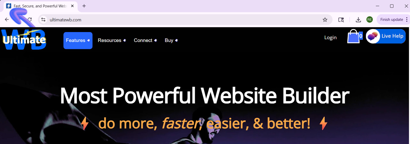
What’s the best way to create a high-quality Favicon and add it to your website?

A favicon might be small, but it plays a big role in your website’s branding and user experience. That tiny icon in the browser tab, bookmarks, and shortcuts helps visitors recognize your site instantly and gives your website a professional touch. So, how do you create a high-quality favicon that stands out? And how do you add it to your website the easy way? Let's
... Continue reading
Posted in Ask David!, Website Design
Tagged bookmarks, branding, browser tab, browser tab icon, contrast, create favicon, favicon, favicon design, GIMP, Gimp favicon, high-contrast colors, internet browser icon, photoshop, Photoshop favicon, PNG to ICO, shortcuts, upload favicon, user experience, web design tips, website branding, website customization, website icon, website recognition, website user experience
Leave a comment
Cracker Barrel’s Logo Disaster: How $70 Million and a Little Nostalgia Shook a Southern Icon

Cracker Barrel is an American classic. The rocking chairs on the porch, the old-timey decor, and yes, that iconic “Uncle Herschel” leaning on a barrel - it’s a slice of Southern charm that feels familiar to millions. But earlier this year, the restaurant chain decided it was time for a change. And oh boy, did things go sideways.
The New Logo That Nobody Asked For
In 2025, Cracker Barrel unveiled a brand-new logo. Gone was Uncle Herschel, the friendly mascot
... Continue reading
Posted in Marketing, Social Media, Technology in the News, Website Design
Tagged $70 million logo, brand identity, branding, branding fails, Cracker Barrel, Cracker Barrel controversy, Cracker Barrel logo backlash, Cracker Barrel logo change, Cracker Barrel news 2025, Cracker Barrel rebrand, Cracker Barrel reversal, Cracker Barrel stock drop, customer feedback, iconic logo, Julie Felss Masino, logo, logo change, logo disaster, minimalism, modern, modernization, new logo, nostalgia, public outcry, rebranding, rebranding controversy, social media, tradition, Uncle Herschel, Uncle Herschel logo, user feedback, viral backlash
Leave a comment
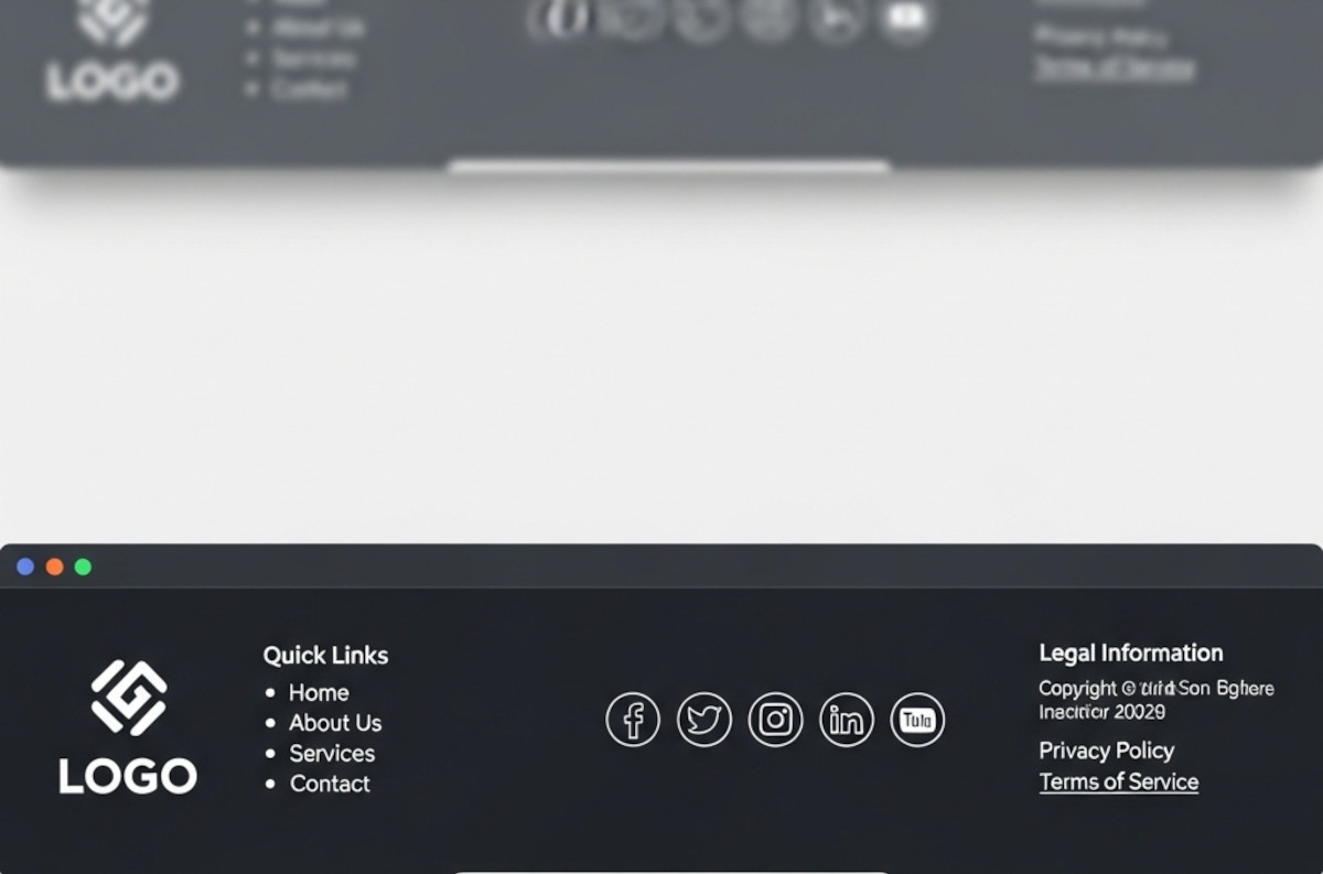
What Makes a Good Website Footer (Yes, You Really Need One)

Ah, the footer. That humble strip at the bottom of your website that most people ignore until they need it - or until they realize their website looks like it stops abruptly, like a book with no last page.
If you’ve ever wondered, “Do I really need a footer? What should even go in there?”, you’re not alone. Let’s break it down.
1. The Basics: What a Footer Is For
Think of your footer as the “everything else” section.
... Continue reading
Posted in Website Design
Tagged avoid clutter, branding, build trust, call to action, contact info, credibility, credibility signals, easy cms, easy navigation, footer, footer design, legal pages, mailing list, mailing list app, newsletter signup, privacy policy, quick links, readable, site organization, social media, social media links, tagline, terms of service, tos, web design tips, website footer, website navigation, website usability
Leave a comment
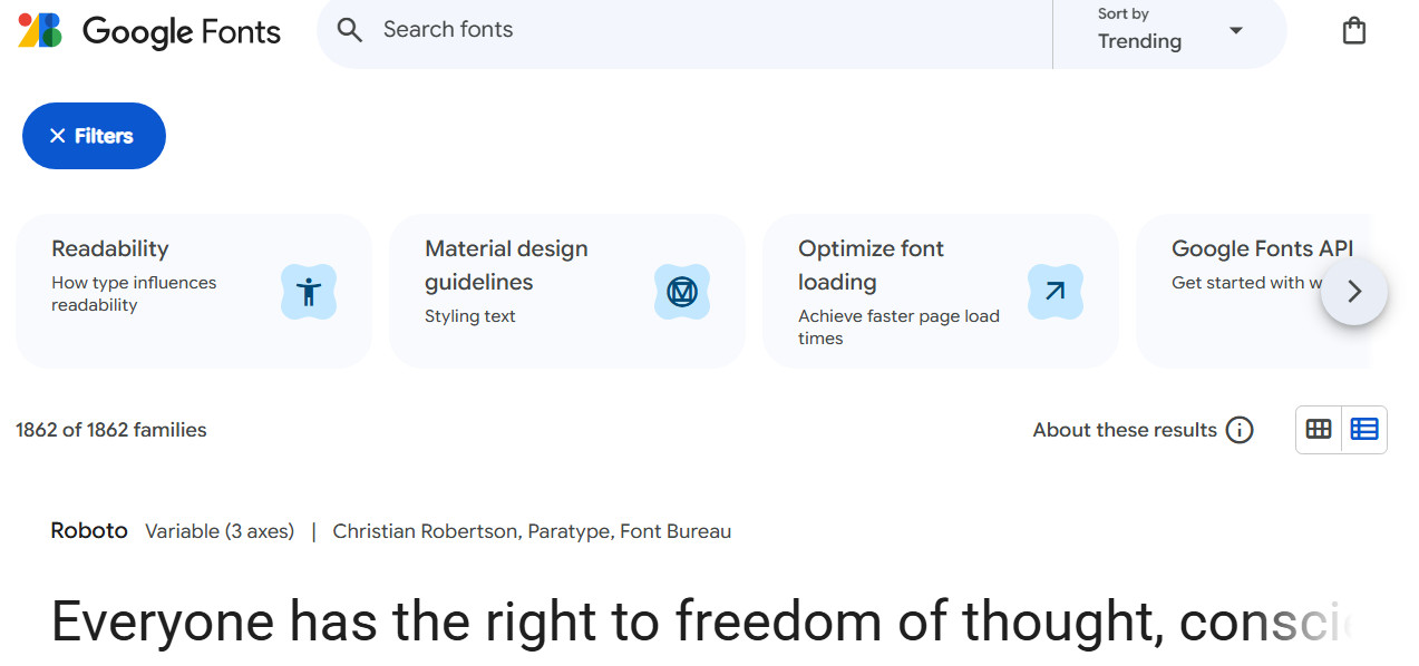
Choosing Website Fonts Made Easy: A Step-by-Step Guide

Choosing fonts for your website can feel overwhelming. With thousands of typefaces available, how do you pick one that looks professional, is easy to read, and fits your brand? The truth is, you don’t need a design degree to make smart choices. This guide breaks it down into simple, actionable steps with examples you can follow today.
1. Understand the Two Main Font Categories
There are two primary categories of fonts you should
... Continue reading
Posted in Website Design
Tagged brand identity, brand personality, branding, casual, choose fonts, consistency, creative, fancy fonts, fast, font pairing, fonts, friendly, fun, google fonts, mobile-friendly, modern fonts, playful, polished, professional, readability, sans-serif fonts, serif fonts, size, spacing, trustworthy, typography, web-safe fonts, weight
Leave a comment
CSS Gradients Tutorial: How to Use Easy, Modern, Fast, and Flexible Backgrounds in Web Design

Gradients are one of the simplest ways to make a website look modern and polished. Instead of creating PNG or JPG backgrounds in Photoshop, you can now define smooth color transitions directly in CSS. This keeps your site lightweight, scalable, and easy to maintain - while giving you complete control over colors, angles, shapes, and even animation.
In this post, we’ll explore what gradients are, the different types, and - most importantly - how to add them to your UltimateWB
... Continue reading
Posted in AI, Website Design
Tagged ai, animation, background effects, chatgot, class, css, css gradients, css tricks, css tutorial, easy design, fast loading websites, fast-loading, fast-loading background, flexible design, frontend development, gemini, html, id, image background alternative, jpg, metallic reflections, modern background, modern design, modern effects, modern web design, pagespeed insights, performance, png, responsive, responsive design, styles manager, transparency, web design, website performance
Leave a comment
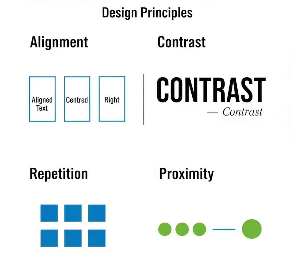
Tutorial: How to Instantly Make Your Designs Look Cleaner

Ever notice how some websites or graphics just feel “off,” even if you can’t put your finger on why? Most of the time, it comes down to a few small mistakes that make a layout look messy. The good news: once you know what to look for, you can fix these issues quickly and make your work look more polished and professional.
Here’s a simple tutorial on the four core principles that will clean up almost any design.
1. Alignment:
... Continue reading
Posted in Website Design
Tagged alignment, avoid clutter, beginner design guide, clarity, clean design, clutter, color, consistency, contrast, design consistency, design hacks, design principles, design repetition, design tricks, design tutorial, fonts, good design, improve website design, layout design, proximity, repetition, spacing, trust, trustworthy, ux design, visual hierarchy, web design tips, white space, whitespace
Leave a comment
Why Blocking Paste in Form Fields Is a UX Mistake

If you’ve ever tried to paste information into a form and were blocked, you know it’s frustrating. Yet, some teams still implement “no-paste” rules for account numbers, confirmation fields, or even passwords. Here’s why that approach doesn’t make sense - and why it’s time to stop.
Copying Improves Accuracy - Even When the First Entry Might Be Wrong
Some stakeholders justify disabling paste by arguing that if a user makes a mistake in the first field, copying it to the
... Continue reading
Posted in Website Design
Tagged accessibility, auto-formatting, blocking paste, form fields, format validation, trust, usability, user experience, ux, wcag, website security
Leave a comment