


-
Recent Posts
- “My Partner Wants to Use WordPress Because 50% of the Web Uses It. Help!”
- Does EmDash Solve WordPress’s Problems, or Do You Need UltimateWB?
- How Not to Use AI: Stanford University Can Tell You
- Best Website Builder for SEO: WordPress vs. Wix vs. UltimateWB
- How to Make Sure Your Website Colors Have Enough Contrast for Accessibility
- Mobile-Friendly Website Checklist: 20 Things to Check
- Beehiiv Website Builder Review: The Problem Isn’t the Design – It’s the Lack of Control
- Elementor’s “Angie” AI Is More Than Bloat: Credits, Subscriptions, and a Growing Platform Problem
- How to Pass Google Business Profile Video Verification for Service Businesses
- The Great Deskilling: Why AI Dependence is Turning Developers into Prompt Babysitters
- The Three-Month Fuse: The Everest Forms Pro Attack and Why a Patched Plugin Can Still Put Websites at Risk
- Computer Screen Has Black Bars on the Sides: How to Fix It
- Could AI Make Humans Extinct Within the Next Decade?
- Is Weebly Getting Out of the Website-Builder Business?
- Are You “Leaking SEO” by Linking to Other Websites?
- Wix Harmony Is Now in Google Gemini. So Why Are Users Still Complaining?
- When AI Sounds Confident but Gets It Wrong: The Mount Shasta Rescue
- When AI Agents Start Working Together, Who Is Really in Control?
Categories
Tag Archives: google fonts
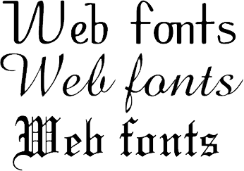
Choosing Website Fonts Made Easy: A Step-by-Step Guide

Choosing fonts for your website can feel overwhelming. With thousands of typefaces available, how do you pick one that looks professional, is easy to read, and fits your brand? The truth is, you don’t need a design degree to make smart choices. This guide breaks it down into simple, actionable steps with examples you can follow today.
1. Understand the Two Main Font Categories
There are two primary categories of fonts you should
... Continue reading
Posted in Website Design
Tagged brand identity, brand personality, branding, casual, choose fonts, consistency, creative, fancy fonts, fast, font pairing, fonts, friendly, fun, google fonts, mobile-friendly, modern fonts, playful, polished, professional, readability, sans-serif fonts, serif fonts, size, spacing, trustworthy, typography, web-safe fonts, weight
Leave a comment
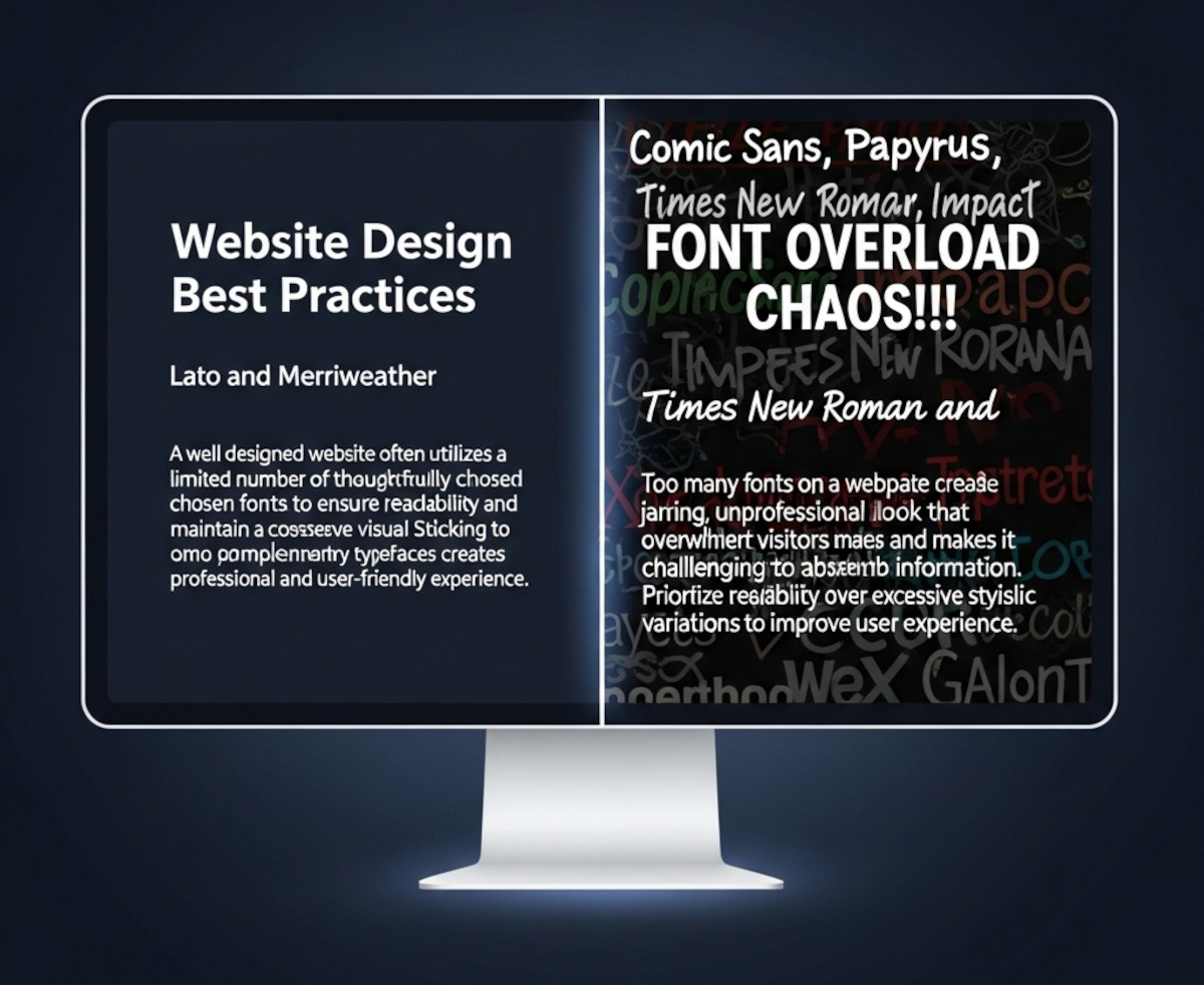
How Many Fonts Should Your Website Use – 1, 2, or More?

When you’re designing a website, picking fonts can be exciting - maybe too exciting. Suddenly, you’ve got your headline in a funky display font, your body text in something clean and minimal, your call-to-action in a bold condensed typeface, and before you know it… your site looks like a ransom note.
So how many fonts should you actually use on your website? The short answer: usually one or two.
Let’s break it down.
Why Font Restraint Matters
Fonts are more
... Continue reading
Posted in Ask David!, Website Design
Tagged branding, clean design, custom fonts, fast website, font choices, font hierarchy, font pairing, font pairs, font performance, fonts, google fonts, headings, headlines, minimalist design, performance, readability, typography, variable fonts, web design, website design tips, website fonts, website speed
Leave a comment
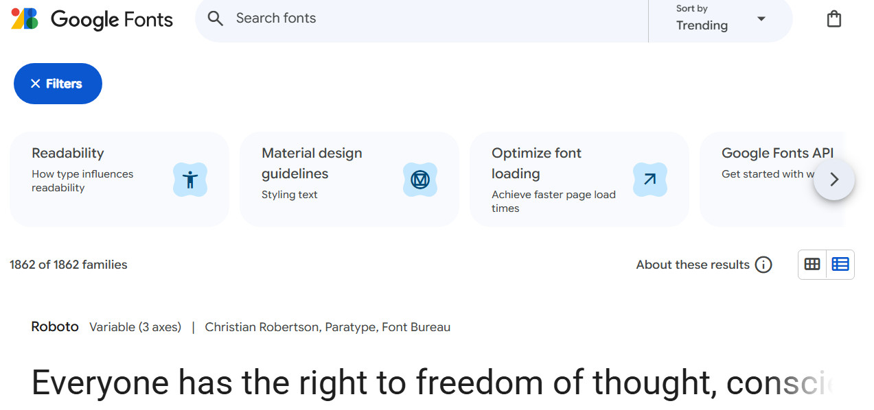
Should You Host Google Fonts Directly on Your Website?

A Closer Look at Performance and Security
When it comes to incorporating fonts into your website, Google Fonts is a popular choice. It offers a vast library of free, high-quality fonts that can enhance the visual appeal of your site. However, there's a common question among web developers: Is it better to host Google Fonts directly on your website, or should you link to them externally? Let's explore the pros and cons of both approaches.