


-
Recent Posts
- Why AI Builders Become Unaffordable at Scale (And the UltimateWB Alternative)
- Why Is Google Indexing New Blog Posts So Much Slower in 2026?
- Why Does Google Gemini Keep Saying “Something went wrong (1099 or 1076)”?
- What Happened to Reddit? API Changes, Shadowbans, Bots, and Community Decline
- What’s Going On with the Etch WP Team? (Digital Gravy Drama Explained)
- Why is the Discover tab missing now from Google Search Console?
- Big Tech’s New Excuse: The AI Smoke Screen
- WooCommerce Subscriptions Cost: Avoid the $279 Add-On Trap
- The Dogfooding Test: What Happens When Web Platforms Don’t Use Their Own Tools?
- Webflow’s 2026 Layoffs Exposed the SaaS Illusion
- The 2026 Kadence WP Corporate Takeover: What Liquid Web’s Consolidation Means for Your WordPress Website
- Why Windows Suddenly Says “Activate Windows” – And How to Fix It Easily
- How to Restore Accidentally Closed Browser Windows and Tabs
- The Right Way vs. The Wrong Way to Do Programmatic SEO (pSEO)
- Stop Fighting Your Website: Absolute Positioning vs. Fluid Design
- Is Your Google Search Console “Average Position” Lying to You?
- Webflow’s 2026 Price Hike: When “Premium” Means Less Bandwidth
- The WordPress Events Calendar Pro Price Hike – and the Alternative
- How can I avoid “AI SEO sludge”?
- What is the difference between advertising and marketing?
Categories
- Accessibility
- Advertising
- Affiliate Programs
- Announcements
- Apps Comparison
- Ask David!
- Business
- Compare Website Builders
- Computer Tips
- Domain Names
- E-commerce
- Emails
- Facebook Application
- General
- Graphic Design
- Integration Tutorials
- Mailing List Application
- Marketing
- Photos Management
- Search Engine Optimization (SEO)
- Social Media
- Social Networking
- Software Showcase
- Technology in the News
- Traffic Statistics
- Troubleshooting
- Web Content
- Web Hosting
- Website Design
- Website Security
- Website Traffic
- WordPress Customization
Meta
Tag Archives: website fonts
How Many Fonts Should Your Website Use – 1, 2, or More?
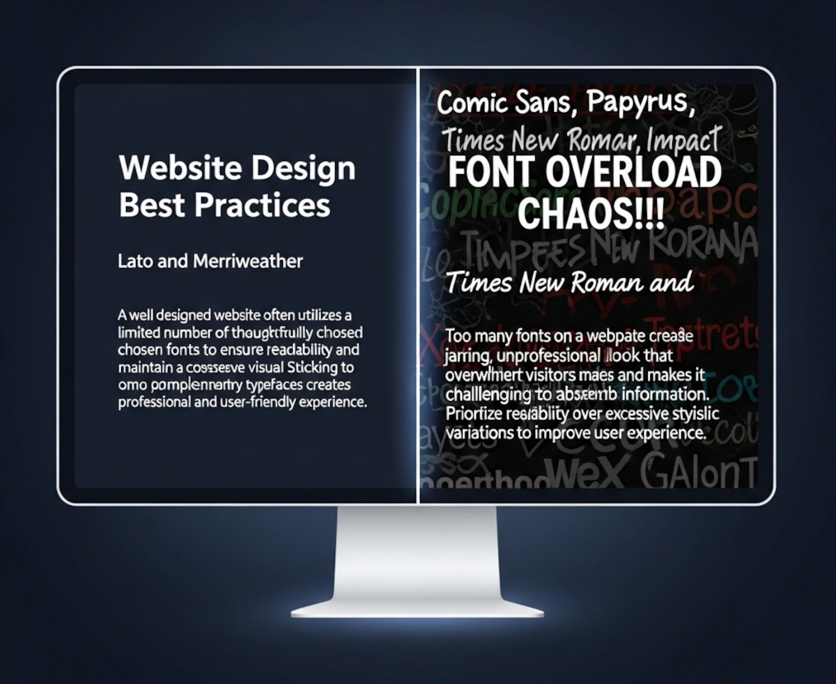
When you’re designing a website, picking fonts can be exciting - maybe too exciting. Suddenly, you’ve got your headline in a funky display font, your body text in something clean and minimal, your call-to-action in a bold condensed typeface, and before you know it… your site looks like a ransom note.
So how many fonts should you actually use on your website? The short answer: usually one or two.
Let’s break it down.
Why Font Restraint Matters
Fonts are more
... Continue reading
Posted in Ask David!, Website Design
Tagged branding, clean design, custom fonts, fast website, font choices, font hierarchy, font pairing, font pairs, font performance, fonts, google fonts, headings, headlines, minimalist design, performance, readability, typography, variable fonts, web design, website design tips, website fonts, website speed
Leave a comment
Top 10 Website Fonts to Avoid Due to Compatibility Issues
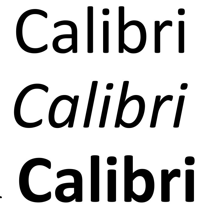
These fonts may not be pre-installed on all devices, leading to potential font substitution issues.
- Calibri, Cambria, Segoe UI, Trebuchet MS: While popular on Windows, these fonts might not be widely available on non-Windows platforms like Mac, iphones, ipads, or older devices.
- Conduit: This font has limited character support, making it unsuitable for international content.
- Impact, Papyrus, Wingdings, Comic Sans, Rockwell: These fonts, often used for informal or decorative purposes, can cause compatibility issues due to their less common nature