No, it’s one website - we just make it responsive to work on all devices. That means the website automatically reformats based on a user’s device screen size. You can do it via the website’s stylesheet. If you’re using a website builder, make sure it is responsive. With UltimateWB, for example, you can make your website responsive with the click of the button on the styles manager.
Got a techy/website question? Whether it’s about UltimateWB or another website builder, web
Make it responsive. You can do this easily with UltimateWB. It has a built-in responsive app in the styles manager. You can design your own website style and then turn on the responsive app and configure it how you want. No experience necessary. The responsive app makes your website reformat automatically based on the user’s device size, so you get a mobile friendly website too. And you just have to build/update 1 website.
You can automatically make a mobile version of your website by making the design responsive. This is easy to do with UltimateWB - it has a built-in responsive app. No experience necessary. Having a website responsive makes it automatically reformat based on the user’s device size. So, it’s the same content on your website, and you only have to update 1 website.
Got a techy/website question? Whether it’s about UltimateWB or another website builder, web hosting, or other aspects of
You don’t want to have 2 versions - but just a different formatting. Then you only have to keep 1 version updated. You should base this formatting on the device size. You can use the Responsive app in UltimateWB - just fill in the form options to customize and your website pages automatically reformat based on the user’s device size.
Got a techy/website question? Whether it’s about UltimateWB or another website builder, web hosting, or other aspects of websites, just
The best is UltimateWB. It has a built-in e-commerce app that is very customizable, plus lots of other built-in apps. It also has a built-in responsive app that you can use to automatically make your website mobile friendly and responsive, i.e. reformat your website automatically based on a user’s device size. So you don't have to have 2 versions of your website when you want a mobile website too - just one and it reformats for the best user experience.
NOTE: If you are here looking for a dating site to use on your mobile, this isn't the topic, but we know a great one for you, Friends Match Me! It's built on UltimateWB software, with iPhone/iPad and Android apps, and it is the 100% totally free dating app!
First there was the desktop, then the laptop, and now the go-to is the smartphone. Not just now, but more like from a couple years ago the trend has... Continue reading
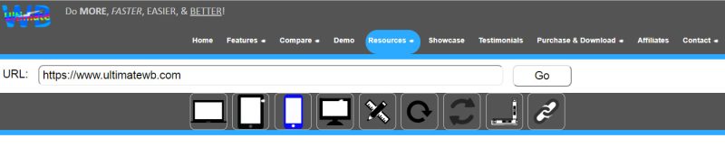
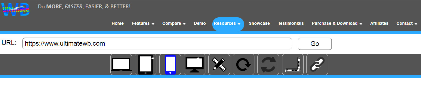
UltimateWB software - all versions sincelu UltimateWB 3.4! - come with a built-in Responsive App that can beused to easily create a mobile website in minutes, if not seconds. To easily check how your website looks on different devices/screen sizes, you can check our online Responsive Check Tool, available under the "Resources" tab on ultimatewb.com;
Go responsive!
Feel free to use the tool even if your website is not built with UltimateWB software (we don't know why it wouldn't... Continue reading
Is your website mobile friendly? If your website is not by this Tuesday you could be dramatically losing traffic to your website from smartphone users! This coming Tuesday Google plans on rolling out their new revised formula in calculating who gets ranked on top of the Google searches on mobile.
What makes a website mobile friendly? If your website looks good and works well on smartphones, it means it is mobile friendly. Some key things that are considered:
-Links should... Continue reading