


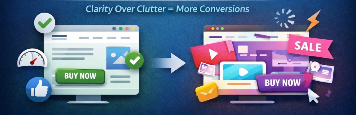
If you’ve ever noticed a plain-looking website (like Craigslist back in the day) outperforming a flashy, animation-heavy one, you’re not imagining things. This happens all the time across industries – from home services to e-commerce to SaaS.
The reason is simple:
People don’t visit websites to admire design. They visit to achieve a goal.
Find a product. Read a menu. Book a service. Get a quote. Buy something.
A “fancy” website can absolutely support that…
– but only if it doesn’t get in the way.
So why do simple, clean websites so often convert better than expensive high-design ones? Here’s what actually drives conversions.
1. Simple Websites Reduce Cognitive Load
Every element on a page demands mental energy – animations, sliders, background videos, heavy graphics, and custom navigation.
High cognitive load = lower conversions.
A simple layout helps because:
- Users immediately understand where things are
- Navigation is predictable
- Calls-to-action (CTAs) stand out
- There’s less “visual noise” to process
Good design isn’t about being fancy. It’s about being easy.
As the old UX saying goes: “Don’t make me think.” or KISS – Keep It Super Simple.
2. Speed Matters More Than Flashy Design
Speed isn’t just a nice-to-have – it directly affects conversions.
Most flashy websites suffer from:
- Large background videos
- Heavy JavaScript animations
- Oversized images
- Bloat from themes or page builders
Simple websites load almost instantly. Faster loading = fewer drop-offs = more conversions.
3. CTAs Are Clear and Obvious
One of the biggest advantages of basic websites is that the CTA is easy to find.
Fancy sites often hide the main action behind:
- Rotating sliders
- Hero animations
- Buttons blending into backgrounds
- Complex navigation
Meanwhile, simple sites put the CTA where it belongs: above the fold, visible, and unmissable.
4. Users Find Information Quickly
People come to a website with a specific task:
- E-commerce: search, categories, pricing, reviews
- Service businesses: services, pricing, contact info, proof of credibility
- Restaurants: menu, hours, location, reservations
If they can’t find what they need in 5 seconds, they leave.
5. Fancy Design Often Prioritizes Appearance Over Function
Designers love beautiful visuals. Users want results.
Fancy sites often focus more on aesthetics than usability:
- Information gets buried
- Animations slow interactions
- Navigation becomes confusing
Form must serve function – not replace it.
6. Simplicity Builds Trust
Clean, minimal sites feel:
- Honest
- Professional
- Credible
Users trust sites that make it easy to find answers and take action. Fancy distractions can reduce that trust instantly.
7. Mobile Experience Is Easier With Simple Design
Over 60% of traffic is mobile. Fancy layouts often break:
- Text overlaps
- Animations lag
- Sliders don’t swipe well
- Buttons become too small
Simple designs naturally scale for mobile, which increases conversions. Of course, if you do it right, fancy can still be totally responsive and mobile-friendly.
8. Your Offer Matters More Than Your Design
Even the most beautiful design can’t fix a weak offer. Users care about:
- Features
- Pricing
- Benefits
- Reviews
- Trust signals
A simple, clear site showcases your offer – without distraction.
Read: What Makes a Simple Website Feel Trustworthy? (From Real User Experience, Not Theory)
9. Big Product Images Beat Fancy Layouts
UX research confirms: larger images convert better.
Simple sites often make product images prominent, allowing users to zoom in and get a feel for the product. Fancy sites may shrink images for aesthetics – hurting conversions.
So When Is Fancy Design Useful?
Fancy design works when:
- Selling luxury or artistic products
- Visual storytelling is central
- Animations don’t slow down usability
- UX principles are followed
But for most businesses, clarity beats cleverness every time.
Read: The Art of Website Storytelling: How to Captivate Your Audience and Boost Engagement
How to Use Instagram to Grow Your Small Business – 8 Types of Posts That Work
Conversion Checklist: What Actually Works
To maximize conversions, focus on:
- Fast loading (under 2 seconds)
- Clear CTA above the fold
- Simple layout
- Readable fonts and spacing
- Strong headline matching visitor intent
- Minimal distractions
- Mobile-friendly design
- Clear value proposition
- High-quality, large images (if selling products)
- Trust signals: reviews, guarantees, real photos
Read: Choosing Website Fonts Made Easy: A Step-by-Step Guide
Tutorial: How to Instantly Make Your Designs Look Cleaner
Final Takeaway
Simple websites convert better not because they’re plain – they convert better because they:
- Make information easy to find
- Make decisions easy to make
- Make actions easy to take
Fancy websites can perform well – but only if they keep friction at zero.
If your site solves the user’s problem quickly and clearly, it will convert – no matter how “basic” it looks.
Want to design your website with a website builder that lets you customize and easily change up your design? Learn more about UltimateWB! We also offer web design packages if you would like your website designed and built for you.
Got a techy/website question? Whether it’s about UltimateWB or another website builder, web hosting, or other aspects of websites, just send in your question in the “Ask David!” form. We will email you when the answer is posted on the UltimateWB “Ask David!” section.