


Ever notice how some websites or graphics just feel “off,” even if you can’t put your finger on why? Most of the time, it comes down to a few small mistakes that make a layout look messy. The good news: once you know what to look for, you can fix these issues quickly and make your work look more polished and professional.
Here’s a simple tutorial on the four core principles that will clean up almost any design.
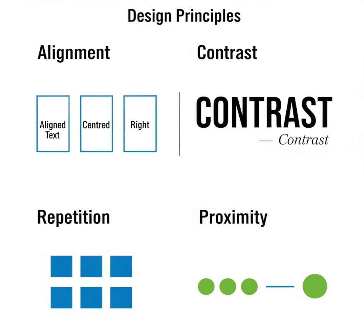
1. Alignment: Pick a Line and Stick to It
One of the fastest ways a layout looks sloppy is when elements are almost lined up but not quite. A heading a few pixels to the left of the paragraph below it, or a button that doesn’t line up with the form field above, throws things off.
How to fix it:
- Decide whether elements will align left, right, center, or on a grid.
- Snap every element to that alignment.
- Avoid “eyeballing it” – consistency is key.
2. Contrast: Make Differences Obvious
A common mistake is making elements just slightly different. For example, a subheading that’s barely larger than body text, or two shades of gray that look almost the same. This creates confusion because it looks accidental.
How to fix it:
- If two elements are supposed to be different, make the difference strong.
- Use clear jumps in size, boldness, or color.
- Remember: contrast is clarity.
Related: What colors evoke what emotions?
What colors evoke what emotions?
Can specific colors or color schemes make a website appear outdated or less modern?
What color background will make your website more successful?
3. Repetition: Keep Things Consistent
Good design feels cohesive because certain styles repeat. Without repetition, each element feels disconnected, like every part of the page was designed in isolation.
How to fix it:
- Pick one or two fonts and use them consistently.
- Repeat colors, button styles, and spacing throughout.
- Think of repetition as the glue that holds your design together.
Related: How Many Fonts Should Your Website Use – 1, 2, or More?
Should You Host Google Fonts Directly on Your Website?
4. Proximity: Group What Belongs Together
When related items are scattered apart, your audience has to work harder to understand what goes with what. On the flip side, when things that don’t belong are squished together, the design feels cluttered.
How to fix it:
- Place related elements close together (e.g., labels with their input fields, captions with their images).
- Add spacing between groups of unrelated items.
- Use white space as a tool for clarity, not as “empty” space.
Related: Embracing Whitespace: The Secret Ingredient to Stunning Web Design
Make Your Website Content Skimmable: Boost Engagement and User Experience
The Big Picture
You don’t need fancy design skills to make clean, professional layouts. By paying attention to alignment, contrast, repetition, and proximity, you’ll avoid the little mistakes that make a design look amateur.
These aren’t advanced design tricks – they’re simple, practical habits. Once you start using them, your work will instantly feel sharper, more intentional, and more trustworthy.
Related: What Makes a Simple Website Feel Trustworthy? (From Real User Experience, Not Theory)
Want to design your website with a website builder that lets you have clean design? Learn more about UltimateWB! We also offer web design packages if you would like your website designed and built for you.
Got a techy/website question? Whether it’s about UltimateWB or another website builder, web hosting, or other aspects of websites, just send in your question in the “Ask David!” form. We will email you when the answer is posted on the UltimateWB “Ask David!” section.