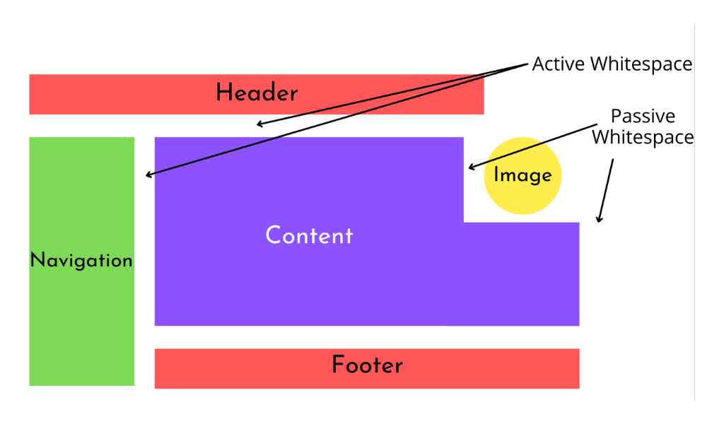
Hey there, web design enthusiasts! Today, let’s dive into a topic that might seem simple, but holds immense power when it comes to crafting jaw-dropping websites – whitespace. You might call it the “breathing room” of web design, and trust me, it’s not to be underestimated!
So, what’s whitespace? No, it’s not some invisible ink. It’s the empty space between elements on a webpage. And believe it or not, it’s one of the most essential design tools you have in your arsenal.
First Impressions Matter
Imagine entering a room crammed with furniture, knick-knacks, and chaos. Overwhelming, right? Well, web design is a lot like interior design. Just as a well-organized room feels inviting, a well-structured website is inviting too. Whitespace provides that visual relief, letting your content shine and greet visitors without bombarding them.
Clarity Reigns Supreme
You’ve got an amazing product or story to share, but if your webpage is a jumble of text, images, and buttons, good luck getting your message across. Whitespace helps you organize content, guide the user’s eye, and direct their focus where you want it. It’s like a visual GPS, ensuring visitors don’t get lost in the chaos.
A Zen-Like User Experience
Picture this: you’re reading an article, and suddenly, an obnoxious ad pops up, covering the text. Frustrating, right? Whitespace prevents that kind of mishap by providing enough buffer between elements, making sure users don’t accidentally tap the wrong thing. It’s the art of “touch-friendly” design.
Less is More
We’ve all heard this phrase, and while we don’t believe it’s true when talking about website builder features (UltimateWB is ultimate!), in web design it’s gospel truth. A cluttered page overwhelms users and can even discourage them from staying. Whitespace creates balance, allowing your design elements – images, text, buttons – to breathe, creating a harmonious composition that’s pleasing to the eye.
Mobile Magic
In the mobile age, where every pixel counts, whitespace is a superhero. It ensures your site looks just as stunning on a tiny smartphone screen as it does on a massive desktop monitor. It’s all about adaptability, and whitespace is your trusty sidekick in making that happen.
So, How Do You Embrace Whitespace?
Start by thinking minimalistic – simplicity is your best friend. Use whitespace intentionally – let it frame your content, guide users’ eyes, and maintain a sense of order. Don’t be afraid of “empty” spaces – they’re anything but empty. They’re placeholders for focus, clarity, and a delightful user experience.
In a world buzzing with visual noise, whitespace offers a serene haven. It’s the designer’s pause button, allowing your users to take a breath and enjoy what you’ve created. So, the next time you’re crafting a website, remember, whitespace isn’t just empty space – it’s the canvas upon which your design masterpiece comes to life.


