


Short Answer: Yes, you will get a better search engine ranking and your website will be user friendly. It’s easy with UltimateWB – just activate the Responsive app.
Longer Answer: Yes, it is essential for your website to be mobile-responsive. In fact, Google has made it clear that mobile-friendliness is a ranking factor in search results. This means that if your website is not mobile-responsive, it could be penalized in search results, which could lead to less traffic and fewer conversions.
Why is important for your website to be mobile-responsive?
First, more and more people are using their smartphones and tablets to access the internet. In fact, according to a recent study by Statista, mobile devices accounted for over 54% of global website traffic in 2022. This means that if your website is not mobile-responsive, you are missing out on a large segment of potential visitors.
Second, mobile-friendly websites are simply more user-friendly. When users visit your website on their mobile devices, they expect to be able to easily navigate the site and view the content without having to zoom in and out or scroll horizontally. If your website is not mobile-responsive, it will be difficult for users to use it, which could lead to them leaving your site altogether.
Finally, mobile-friendly websites are more likely to be shared on social media. When users find a website that is easy to use on their mobile devices, they are more likely to share it with their friends and followers on social media. This can help to increase traffic to your website and boost your online visibility.
How to check & make your website responsive?
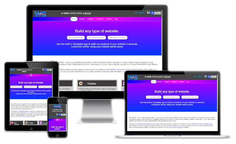
When you build your website with UltimateWB website builder, making your website responsive can be as easy as activating the Responsive app from your website admin panel Styles Manager. You can customize the related functionalities and design there, such as when the Menu collapses to an expandable Menu button and how the Menu button looks, for smartphones and/or tablets.
You can also easily test whether your website is responsive or not when you build it with the UltimateWB website builder – open your website your internet browser and just resize the window. Your website will automatically reformat for the best user experience based on user device size – or window size – when your website is responsive.
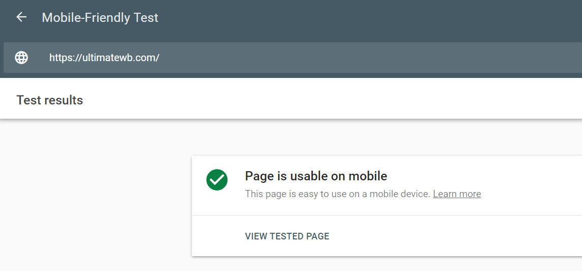
If you are not sure whether your website is mobile-responsive, there are a number of tools that you can use to check. One popular tool is Google’s Mobile-Friendly Test. This tool will scan your website and let you know if it is mobile-friendly or not.
If your website is not mobile-responsive, make sure to activate the Responsive app in UltimateWB so that your website utilizes a responsive design, to automatically adjust the layout of your website based on the device that is being used to view it.
Making your website mobile-responsive is a relatively simple process, and it can have a big impact on your website’s traffic and conversions. If you haven’t already done so, I encourage you to make your website mobile-responsive today.
Got a techy/website question? Whether it’s about UltimateWB or another website builder, web hosting, or other aspects of websites, just send in your question in the “Ask David!” form. We will email you when the answer is posted on the UltimateWB “Ask David!” section.