


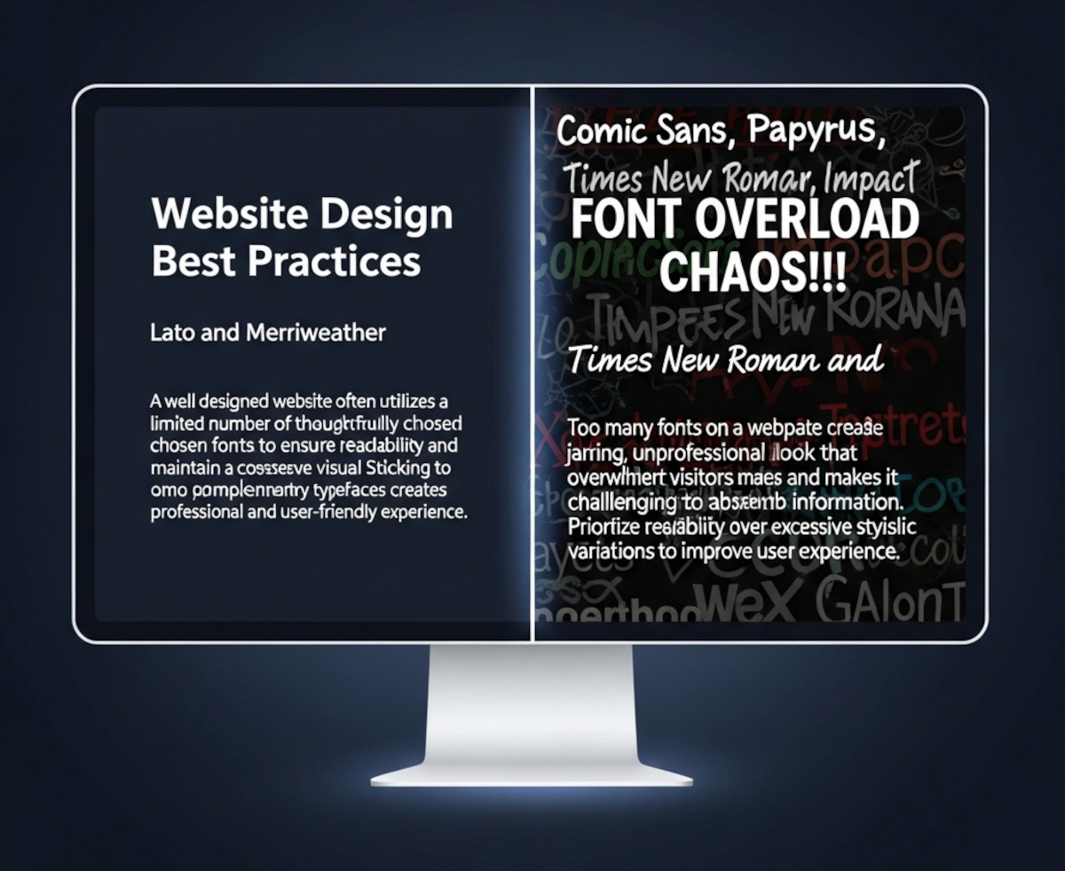
When you’re designing a website, picking fonts can be exciting – maybe too exciting. Suddenly, you’ve got your headline in a funky display font, your body text in something clean and minimal, your call-to-action in a bold condensed typeface, and before you know it… your site looks like a ransom note.
So how many fonts should you actually use on your website? The short answer: usually one or two.
Let’s break it down.
Why Font Restraint Matters
Fonts are more than just decoration – they affect:
- Readability: Too many font styles can make your content harder to scan.
- Brand consistency: A consistent typographic style helps users remember your site and trust it.
- Performance: Each web font you load adds to your page weight and can slow down your site.
- Visual harmony: A clean, unified design feels more professional and less chaotic.
When One Font Is Enough
Sometimes, less really is more. Using a single font family (especially one with multiple weights like light, regular, bold) can be enough to create hierarchy and style.
Best for:
- Minimalist designs
- Portfolio sites
- Landing pages with short content
- Sites where speed is the top priority
Pro tip: Choose a font family that offers multiple weights and styles. For example, Open Sans, Roboto, or Lato all come with light, regular, bold, italic, etc.
When to Use Two Fonts
Two fonts can give your site more personality while keeping things cohesive.
A common pairing strategy:
- Headlines: A distinctive serif or display font for impact.
- Body text: A clean, easy-to-read sans-serif for long paragraphs.
Best for:
- Blogs and editorial sites
- E-commerce stores with varied content sections
- Corporate websites that want personality without chaos
Pro tip: Look for font pairs designed to complement each other. Google Fonts even offers pairing suggestions.
When Three or More Fonts Might Work
This is the typography equivalent of walking a tightrope. Three or more fonts can work, but only if you’re highly skilled in design or working with a strong brand system.
You might see this in:
- High-end magazine layouts
- Large organizations with established brand guidelines
- Sites with distinct sections (e.g., a news site with different fonts for news, features, and opinion)
Warning: Every extra font increases the risk of visual clutter and slows your site down.
Performance Tip: Use System Fonts or Variable Fonts
If speed matters (and it should), consider:
- System fonts like Arial, Helvetica, or Georgia – no downloads needed.
- Variable fonts, which pack multiple styles into one file, reducing load times.
The Bottom Line
- Most sites: 1–2 fonts is the sweet spot.
- Advanced designs: 3+ fonts only if you know what you’re doing.
- Always check readability, brand consistency, and performance before adding another font just because “it looks cool.”
Remember: good typography isn’t about showing off every font you’ve ever loved – it’s about making your message clear, engaging, and on-brand.
For help on incorporating your custom font into your website, check out our blog post, “How can I use a Custom Font on my website?“.
Related: Should You Host Google Fonts Directly on Your Website?
How can you choose web fonts that are both readable and beautiful?
Ready to design & build your own website? Learn more about UltimateWB! We also offer web design packages if you would like your website designed and built for you.
Got a techy/website question? Whether it’s about UltimateWB or another website builder, web hosting, or other aspects of websites, just send in your question in the “Ask David!” form. We will email you when the answer is posted on the UltimateWB “Ask David!” section.