


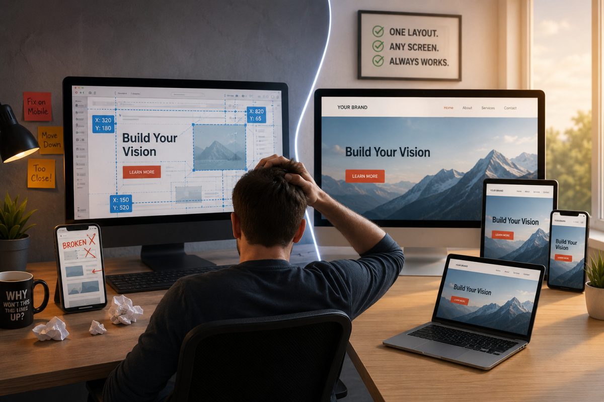
If you’ve ever used the standard Wix editor, you probably know the frustration: move a button on the desktop layout, and suddenly the mobile version looks broken. That is not a glitch – it is a direct result of how many drag-and-drop website builders are designed.
The Hidden Tradeoff in Traditional Drag-and-Drop Builders
Many “easy” website builders like Wix rely heavily on absolute positioning. In simple terms, elements are assigned fixed X and Y coordinates on the page, almost like placing stickers in a digital scrapbook.
At first, that feels flexible because you can place anything exactly where you want it. But there is a major downside: those elements are tied to rigid pixel positions rather than naturally flowing with the page.
When the screen shrinks from a desktop monitor to a phone, the layout often cannot adapt intelligently on its own. Instead, you end up manually fixing spacing, resizing sections, and rebuilding layouts for different screen sizes.
That is not true responsive design – it is repeated manual maintenance.
Related: How Drag-and-Drop Website Builders Hold You Back (And What to Use Instead)
Squarespace’s Grid vs. UltimateWB’s Fluid Approach
Squarespace’s “Fluid Engine” improved flexibility by introducing a denser grid system. However, it still requires significant manual adjustment because elements remain constrained by grid behavior rather than true document flow.
UltimateWB takes a fundamentally different approach.
Percentage-Based Layout Logic
Instead of relying on rigid pixel positioning, UltimateWB uses fluid widths and proportional layouts. As the screen changes size, elements resize and reposition naturally in relation to one another.
The Responsive App Handles the Heavy Lifting
UltimateWB’s built-in Responsive App automatically stacks and reflows content for smaller screens. You are not building separate desktop, tablet, and mobile versions of the same site.
You build one intelligent layout that adapts across everything from a 30-inch monitor to a smartphone.
Responsive App tutorials: How to create your own responsive website without any coding!
How to make content sections with custom formatting also RESPONSIVE
Built on Modern Web Architecture
UltimateWB uses modern layout structures based on divs and containers instead of floating disconnected elements across the page.
On platforms like Squarespace, elements are treated as independent, disconnected objects. If you add text to a paragraph block, it doesn’t know the other elements exist – it will simply expand and overlap a button sitting below it until you manually push things down.
UltimateWB uses a structured, container-based architecture (divs) that creates a natural document flow. Because elements are housed inside intelligent containers, they maintain a structural relationship with one another. If one section expands with new content, it naturally and cleanly pushes the content below it downward.
This creates a far more stable foundation:
- Layouts stay organized,
- Content scales more predictably,
- And pages are less likely to “break” when new content is added later.
Quick Reference: Absolute Positioning vs. Fluid Flow
| Feature | Absolute Positioning (Wix / Squarespace Fluid Engine) | Fluid Design (UltimateWB) |
| Design Core | Fixed X & Y coordinates (Sticker book model) | Percentage-based widths & dynamic containers (Divs) |
| Mobile Adaptability | Manual. Requires rearranging and resizing elements for every screen. | Automatic. The layout naturally reflows and scales to fit the device. |
| Layout Stability | Fragile. Adding new content can overlap or push existing elements out of place. | Stable. Elements maintain a structural relationship with one another. |
| Long-Term Scaling | Difficult. High-maintenance for large, content-heavy websites. | Highly scalable. Built on professional, standard web architecture. |
Why This Matters Beyond Design
This is not just about convenience. It is also about ownership and long-term control.
Many absolute-positioning builders rely on proprietary systems that cannot realistically be exported or self-hosted. Your website becomes deeply tied to that platform’s ecosystem.
If pricing changes, features disappear, or policies shift, moving your site elsewhere can become extremely difficult.
UltimateWB gives you the usability of a visual builder while maintaining the underlying architecture of a professionally structured website.
Most importantly, you own your data. You can download your website and host it on your own server if you choose – something platforms like Wix and Squarespace do not allow, as they are hosted website builders.
The Bottom Line
Responsive design should not mean constantly rebuilding layouts for every screen size.
A modern website builder should adapt naturally, stay structurally stable, and give you control over your own website instead of locking you into a proprietary system.
Stop fighting your layouts. Build once with a platform designed to flow with the modern web.
Ready to own your website with design that makes sense? Check out UltimateWB and our long list of built-in features.
Got a techy/website question? Whether it’s about UltimateWB or another website builder, web hosting, or other aspects of websites, just send in your question in the “Ask David!” form. We will email you when the answer is posted on the UltimateWB “Ask David!” section.