


Gradients are one of the simplest ways to make a website look modern and polished. Instead of creating PNG or JPG backgrounds in Photoshop, you can now define smooth color transitions directly in CSS. This keeps your site lightweight, scalable, and easy to maintain – while giving you complete control over colors, angles, shapes, and even animation.
In this post, we’ll explore what gradients are, the different types, and – most importantly – how to add them to your UltimateWB website.
What Are CSS Gradients?
A gradient is a transition between two or more colors. Unlike images, gradients are generated by the browser, which means:
- They scale perfectly on any screen size.
- They load faster than background images.
- They give you design flexibility without needing Photoshop.
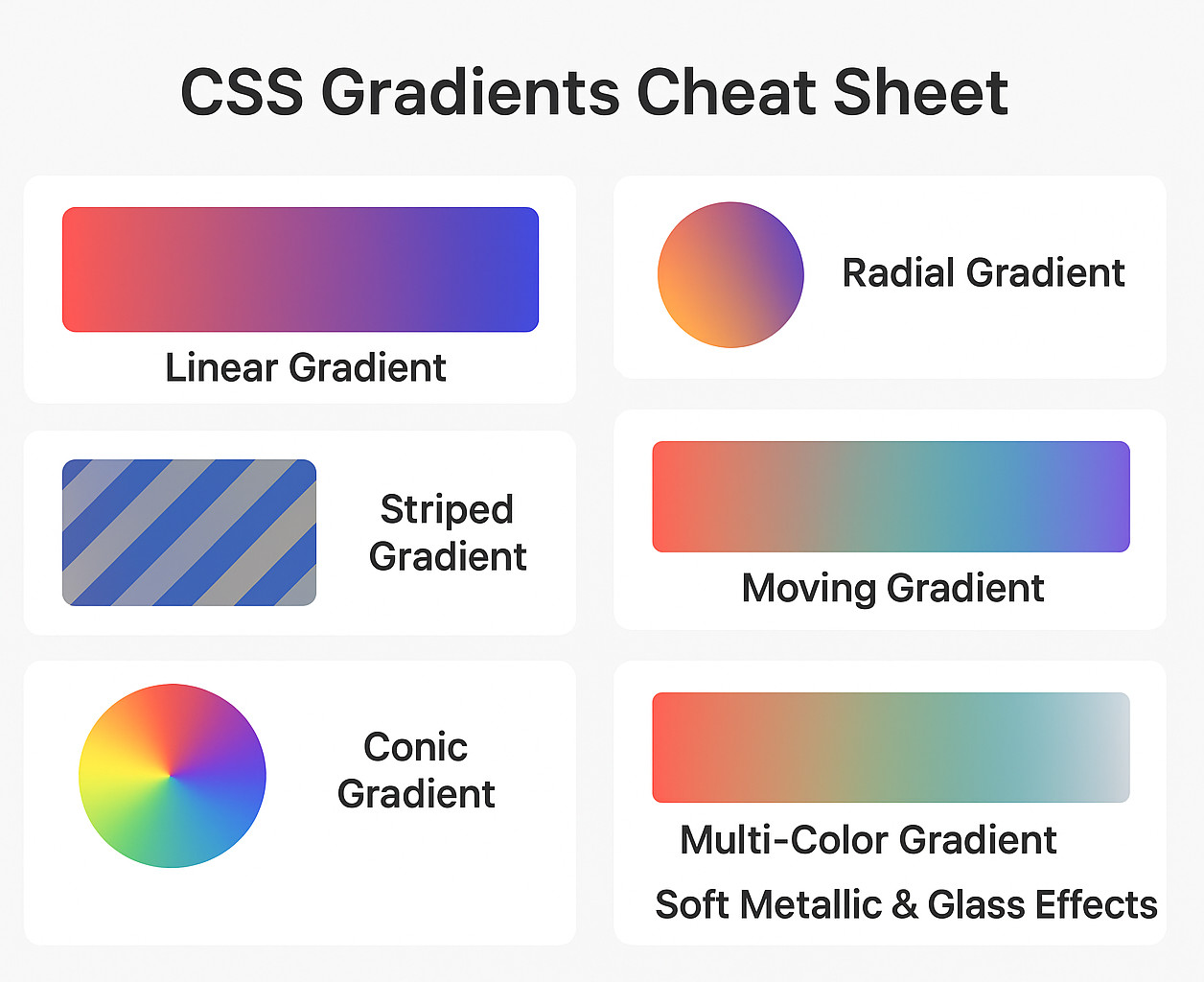
There are three main types of gradients in CSS:
- Linear Gradients – colors flow in a straight line (horizontal, vertical, diagonal).
- Radial Gradients – colors spread out in a circular or elliptical shape.
- Conic Gradients – colors transition around a center point like a color wheel
✅ Why Use CSS Gradients?
- 🚀 Performance: No more heavy PNG or JPG files. Better PageSpeed Insights scores.
- 📱 Responsive: Scales to any screen size without losing quality.
- 🎨 Flexible: Easy to tweak directions, colors, and stops without needing PhotoShop.
- ✨ Modern Effects: Supports transparency, metallic reflections, and animation.
Let’s walk through the most useful types of CSS gradients with ready-to-use examples.
1. Linear Gradients
Linear gradients create smooth transitions along a straight line.
Syntax:
background: linear-gradient(direction, color-stop1, color-stop2, ...);
Direction options:
to top,to bottom,to left,to rightto top left,to bottom right- Angles like
90deg(to right),135deg, etc.
Example (Angled Gradient):
.my-linear-gradient {
  background: linear-gradient(135deg, #00ffff, #000080);
}
This creates a diagonal gradient from cyan (#00ffff) to navy blue (#000080).
2. Radial Gradients
Radial gradients spread outward from a central point, creating circular or elliptical effects.
Example (Circular Gradient):
.my-radial-gradient {
  background: radial-gradient(circle at center, #ff8c00, #3c003c, #000000);
}
This produces a circular gradient starting with orange (#ff8c00) in the middle, fading into deep purple (#3c003c), and finally black (#000000).
3. Repeating Gradients
Repeating gradients let you build textures or patterns like stripes.
Example (Diagonal Stripes):
.repeating-stripes {
  background: repeating-linear-gradient(
    45deg,
    #007bff,
    #007bff 10px,
    #6c757d 10px,
    #6c757d 20px
  );
}
This generates alternating 10px stripes of blue (#007bff) and gray (#6c757d) on a diagonal.
4. Conic Gradients
Conic gradients transition colors around a central point, similar to a pie chart.
Example (Color Wheel):
.my-conic-gradient {
  background: conic-gradient(
    from 0deg at center,
    #ff0000,
    #ffff00,
    #00ff00,
    #00ffff,
    #0000ff,
    #ff00ff,
    #ff0000
  );
}
This creates a full circular spectrum: red → yellow → green → cyan → blue → magenta → back to red.
5. Multi-Color Gradients
You’re not limited to just two colors. Multiple stops create richer, layered transitions.
Linear Example:
background: linear-gradient(90deg, #ff7f50, #ff1493, #1e90ff, #32cd32);
A horizontal gradient: coral → deep pink → blue → lime green.
Radial Example:
background: radial-gradient(circle, #ff7f50, #ff1493, #1e90ff, #32cd32);
A circular gradient starting coral in the center and radiating outward through pink, blue, and lime green.
6. Transparent Gradients
Transparency makes gradients perfect for overlays.
Example (Overlay on Image):
.my-transparent-gradient {
  background: linear-gradient(
      to bottom,
      rgba(0,0,0,0.7),
      rgba(0,0,0,0)
    ),
    url('your-image.jpg');
  background-size: cover;
}
This darkens the top of an image with semi-transparent black, fading to clear – great for making text readable on banners or hero images.
7. Soft Metallic & Glass Effects
Layered gradients can mimic subtle materials like glass, chrome, or brushed metal.
Example (Button Highlight):
.button-glass {
  background: linear-gradient(145deg, #e0e0e0, #ffffff, #c0c0c0);
  border-radius: 12px;
}
This produces a “glass” effect with light and shadow, using gray, white, and silver tones.
8. Animated Gradients
With a little CSS animation, gradients can become dynamic and fluid.
Example (Moving Gradient):
@keyframes gradient-animation {
  0% { background-position: 0% 50%; }
  50% { background-position: 100% 50%; }
  100% { background-position: 0% 50%; }
}

.animated-gradient {
  background: linear-gradient(-45deg, #ff7f50, #ff1493, #1e90ff, #32cd32);
  background-size: 400% 400%;
  animation: gradient-animation 15s ease infinite;
}
This creates a diagonal gradient that cycles smoothly through coral, pink, blue, and lime green. The oversized background-size and shifting positions give it a flowing, dynamic effect.
The Easy Way to Get Your CSS Code
You don’t need to spend hours experimenting with gradients or memorizing CSS syntax. With AI tools like ChatGPT, Gemini, or others, creating beautiful gradients is as simple as describing what you want. Just tell the AI:
- The colors you want to use
- The direction of the gradient (top to bottom, left to right, diagonal, etc.)
- The type of gradient (linear, radial, conic, etc.)
The AI will instantly provide you with ready-to-use CSS code. Copy it into your website editor, and your section will have the perfect gradient effect in seconds – no trial and error needed.
Example: AI-Generated Gradient CSS
Let’s say you want a linear gradient going from blue to purple, top to bottom. You can simply tell an AI:
“Create a linear gradient from blue to purple, top to bottom.”
It might generate CSS like this:
.my-gradient-section {
  background: linear-gradient(to bottom, #3498db, #9b59b6);
  padding: 50px;
  color: white;
  text-align: center;
}
Then, in your HTML:
<div class="my-gradient-section">
  <h2>Beautiful Gradient Made Easy</h2>
  <p>Created instantly with AI assistance.</p>
</div>
And just like that, your section has a professional-looking gradient – no manual coding required. Read on to the next section on the detailed explanation on how the HTML works with the CSS…
How to Add CSS Gradients to Your Website (UltimateWB Guide)
Let’s go into the setup details! Adding gradients in UltimateWB is straightforward – you can do it right on your Add/Edit Page, or in your Styles Manager, depending on where you want the CSS code to appear.
1. Assign a Class or ID to Your Section
- Go to Add/Edit Page in your UltimateWB admin panel.
- Scroll down to the Page Editor.
- Click the Code (
<>) button to edit the HTML. - Find the element (like a
<div>or<section>) where you want the gradient.- If it already has a
classorid, you can reuse it. - If not, add one.
- If it already has a
Example:
<div id="hero-section">
    <h1>Welcome to My Website</h1>
</div>
Here, we’ve given the section an ID called hero-section.
2. Add the Gradient CSS
Now that you have an ID or class, you need to apply the CSS. UltimateWB gives you two options:
Option A: Page-Specific CSS (UltimateWB 9+ Feature)
- On the same Add/Edit Page screen, scroll down to the “Add Code: In head section, right before end head tag” section.
- Add your gradient CSS there.
Example:
<style>#hero-section {
    background: linear-gradient(to right, #ff7e5f, #feb47b);
    color: white;
    padding: 100px;
    text-align: center;
}</style>
This will only apply to that page.
Option B: Global CSS (Across Multiple Pages)
If you want to reuse the gradient across your site:
- Go to Styles Manager → Extras Section.
- Add the CSS there so it’s included in your main stylesheet.
Example:
.gradient-background {
    background: radial-gradient(circle, #00c6ff, #0072ff);
    color: white;
    padding: 50px;
}
Then in your Page Editor, simply assign that class:
<div class="gradient-background">
    <p>This section has a gradient background!</p>
</div>
CSS Gradient Cheat Sheet (Quick Reference)
- Linear Gradient:
background: linear-gradient(to right, #ff7e5f, #feb47b); - Radial Gradient:
background: radial-gradient(circle, #00c6ff, #0072ff); - Conic Gradient:
background: conic-gradient(from 90deg, red, yellow, green);
Wrap-Up
Gradients are a simple but powerful design trick to make your website look more dynamic. With UltimateWB’s page-specific CSS editor and global Styles Manager, you can easily add gradients wherever you want – whether for just one section or across your whole site.
CSS gradients are a lightweight and versatile way to modernize your site’s visuals. From subtle overlays to dynamic animated backgrounds, they let you experiment endlessly without slowing down your site. Try out the examples above, customize the colors, and you’ll see how much better gradients can make your designs look.
👉 Experiment with different directions, color stops, and types until you find the look that best fits your brand.
Ready to design & build your own website with awesome modern gradients? Learn more about UltimateWB! We also offer web design packages if you would like your website designed and built for you.
Got a techy/website question? Whether it’s about UltimateWB or another website builder, web hosting, or other aspects of websites, just send in your question in the “Ask David!” form. We will email you when the answer is posted on the UltimateWB “Ask David!” section.