Choosing fonts for your website can feel overwhelming. With thousands of typefaces available, how do you pick one that looks professional, is easy to read, and fits your brand? The truth is, you don’t need a design degree to make smart choices. This guide breaks it down into simple, actionable steps with examples you can follow today.
1. Understand the Two Main Font Categories
There are two primary categories of fonts you should know:
- Serif fonts – Fonts with small lines or “feet” at the ends of letters. They feel traditional, trustworthy, and elegant.
Examples: Times New Roman, Georgia, Playfair Display
Best use: Blogs, law firms, finance websites, or any site where trust and professionalism matter. - Sans-serif fonts – Clean, modern fonts with no extra strokes. They feel approachable and are easier to read on screens.
Examples: Arial, Helvetica, Open Sans, Roboto
Best use: Technology, e-commerce, and creative websites; perfect for body text.
Tip: For most websites, use sans-serif fonts for body text.
2. Limit the Number of Fonts
Too many fonts make a website look messy. A simple rule:
- 1 font for headings
- 1 font for body text
If you want variety, pick heading fonts that pair well with your body font, but stick to no more than 2–3 fonts in total.
Examples of font pairings:
- Montserrat (headings) + Open Sans (body) – Modern, clean, versatile
- Playfair Display (headings) + Lora (body) – Elegant and professional
- Raleway (headings) + Roboto (body) – Creative, friendly, and readable
3. Prioritize Readability
Your website visitors should be able to read your content effortlessly. Consider:
- Font size: 16–18px for body text is ideal.
- Line height: 1.5x the font size keeps lines readable.
- Contrast: Dark text on a light background works best.
Example CSS for readable text:
body {
  font-family: "Open Sans", sans-serif;
  font-size: 16px;
  line-height: 1.5;
  color: #333;
}
Tip: Avoid fancy scripts for paragraphs – they look nice but slow reading.
4. Match Fonts to Your Brand Personality
Fonts communicate emotion and style. Ask yourself:
- Do I want my brand to feel friendly, professional, playful, or creative?
- Will visitors perceive my brand as trustworthy, innovative, or fun?
Examples by brand personality:
- Professional: Lora, Merriweather, Georgia
- Creative/Modern: Poppins, Raleway, Montserrat
- Playful/Casual: Comic Neue, Nunito, Fredoka One
Your font choices should reinforce your brand identity.
5. Use Web-Safe or Google Fonts
Not every font works online. Some may not display correctly on all devices. To avoid surprises:
- Web-safe fonts: Arial, Times, Verdana, Georgia
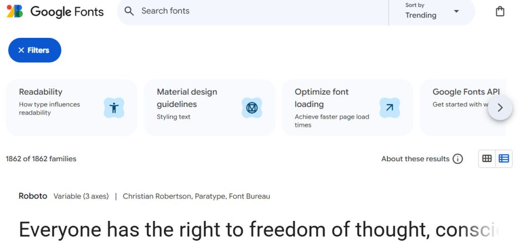
- Google Fonts: Free, widely supported, and easy to integrate
Examples: Roboto (modern), Lato (friendly), Playfair Display (elegant headings)
Tip: Google Fonts also shows font pairings, making it easier to choose complementary styles.
Related: Should You Host Google Fonts Directly on Your Website?
6. Keep It Consistent
Once you choose your fonts, use them consistently across your website:
- Headings should always use the same font and hierarchy (H1, H2, H3).
- Body text should maintain the same font, size, and line spacing.
Example:
- H1: Montserrat, 36px, bold
- H2: Montserrat, 28px, semi-bold
- Body: Open Sans, 16px, regular
Consistency makes your site look polished and professional.
7. Test Your Fonts
Even if a font looks great on your screen, make sure it works for real visitors:
- View your site on mobile, tablet, and desktop.
- Check readability at different sizes.
- Ask friends or colleagues for feedback.
Tip: A font that’s hard to read on mobile can turn visitors away faster than anything else.
8. Using a Single Font for Speed and Performance
Sometimes, less is more. Using just one font across your entire website can improve performance because the browser only downloads one font file instead of multiple.
But here’s the trick: you can make it look like you’re using multiple fonts by adjusting the weight, size, line height, and letter spacing for headings and body text.
Example from our UltimateWB website:
@font-face {
  font-family: 'opensans';
  src: url('OpenSans-Regular.woff2') format('woff2'),
       url('OpenSans-Regular.woff') format('woff');
  font-display: swap;
}

h1, h2, h3, div {
  font-family: opensans !important;
}

h1 {
  font-weight: 700;
  font-size: var(--scale-1);
  line-height: 1.05;
  letter-spacing: -0.02em;
}

h2 {
  font-weight: 600;
  font-size: var(--scale-2);
  line-height: 1.12;
}

p, li, label {
  font-weight: 400;
  line-height: 1.6;
  font-size: var(--base);
}
What this does:
- Single font family: Only
Open Sansis loaded, keeping the site fast. - Different weights for headings and body: Makes headings bold, body text regular.
- Adjusted line height and letter spacing: Ensures headings stand out while body text remains readable.
- Scalable sizes: Variables like
var(--scale-1)andvar(--base)help headings and body text scale well on all devices.
By tweaking weight, spacing, and size, your site can feel typographically rich while staying lightweight and fast.
Final Thoughts
Choosing website fonts doesn’t have to be scary. Stick to 2–3 fonts max, prioritize readability, match your brand personality, and consider using a single font for better performance. With these tips, even a non-designer can create a website that looks clean, professional, and inviting.
Ready to design & build your own website with your brand-matching fonts? Learn more about UltimateWB!
If you want a website that looks expertly designed without worrying about fonts, colors, or layouts, check out our web design packages – we can create a site that converts visitors into customers.
Got a techy/website question? Whether it’s about UltimateWB or another website builder, web hosting, or other aspects of websites, just send in your question in the “Ask David!” form. We will email you when the answer is posted on the UltimateWB “Ask David!” section.


