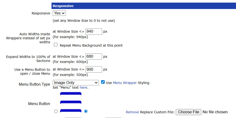
Creating a website that works well across a wide range of devices and screen sizes is a must-have. Two main approaches are responsive web design and adaptive web design. While both aim to make websites user-friendly on desktops, tablets, and smartphones, they achieve it in very different ways.
What Is Responsive Web Design?
Responsive web design (RWD) is a fluid approach that uses CSS media queries to automatically adjust a website’s layout depending on the screen size. This means your website will resize, reformat, and reorganize itself to fit the device it’s being viewed on – whether it’s a smartphone, tablet, laptop, or desktop.
This is the technique that our UltimateWB website builder software and its built-in Responsive app use. With responsive design, you only need one layout and one codebase, and it will work across all devices automatically.
Key benefits of responsive design:
- Easier to maintain (single layout)
- SEO-friendly (one URL per page)
- Future-proof for new devices and screen sizes
- Ideal for content-heavy websites
What Is Adaptive Web Design?
Adaptive web design (AWD) uses predefined layouts optimized for specific device categories. Instead of continuously resizing like responsive design, adaptive design detects the user’s device or screen size and serves the layout best suited for that device.
For example, an adaptive website might have:
- One layout for smartphones
- One layout for tablets
- One layout for desktops
Sounds like a lot more work than responsive web design, right?! Just imagine every time you want to update something, you would need to update each layout separately. With responsive web design, and the UltimateWB built-in Responsive app, you don’t have to worry about any of that – updates are made once, and your website works across all devices.
Key considerations for adaptive design:
- Can deliver highly optimized layouts for each device
- May increase maintenance if multiple layouts need frequent updates
- Useful in rare cases for specialized applications or dashboards
Responsive Design With Adaptive-Like Tweaks
UltimateWB’s responsive system also allows you to add tweaks at specific breakpoints. For example, the expandnodiv class can hide elements at the width you choose, and CSS rules can adjust widths, flex directions, or element visibility depending on the device:
@media all and (max-width: 680px) {
  .expandnodiv { display: none !important; }
}
This gives you the advantages of adaptive control without maintaining multiple layouts or sites. It’s responsive at its core, but with the flexibility to optimize specific elements for different devices.
Responsive vs Adaptive: Side-by-Side Comparison
| Feature | Responsive Design | Adaptive Design |
|---|---|---|
| Layout behavior | Fluid and continuous | Fixed layouts at predefined breakpoints |
| Number of layouts | One flexible layout | Multiple predefined layouts |
| Device targeting | Based on screen size | Based on screen or device detection |
| Maintenance | Easier | More complex |
| Performance control | General | Highly optimized per layout |
| SEO complexity | Lower | Higher if multiple layouts are not managed carefully |
Why Responsive Web Design Is the Clear Winner
For virtually all websites – especially content-driven, business, community, and e-commerce sites – responsive design is the superior choice. It provides a seamless user experience across all devices, reduces maintenance, and keeps your site future-proof.
Classic adaptive design is rarely needed today. With responsive design and optional tweaks like expandnodiv, you can:
- Adjust layouts at specific breakpoints
- Hide or show elements for certain devices
- Maintain a single, unified codebase
The few scenarios where adaptive might make sense – such as performance-critical dashboards or highly specialized web applications – are exceptions rather than the rule.
Final Thoughts
- Responsive design: flexible, easy to maintain, works across all devices – the clear winner for almost all websites
- Adaptive design: controlled, optimized per device, but rarely necessary for modern websites
With UltimateWB’s built-in Responsive app, you get the benefits of responsive design out of the box, along with the ability to make adaptive-like tweaks when needed – giving you the perfect combination of simplicity, flexibility, and control.
Are you ready to design & build your own responsive website? Learn more about UltimateWB! We also offer web design packages if you would like your website designed and built for you.
Got a techy/website question? Whether it’s about UltimateWB or another website builder, web hosting, or other aspects of websites, just send in your question in the “Ask David!” form. We will email you when the answer is posted on the UltimateWB “Ask David!” section.


